Allstate Agent Blog
Role:
UI Designer
The Ask
A blog for Allstate Agent where agency owners and agents can share their experiences in establishing an agency, working at an agency, or any other aspect of their life they feel relates to Allstate. This blog would host varying written content from Allstate agency owners and agents.
Initial Research
Visual - The Allstate Agent visual aesthetic is completely different from Allstate's, primarily due to color use. Allstate's main visual aesthetic is based in a strong, saturated, royal blue. Allstate Agent uses a softer, light blue, along with teal as an accent color and a charcoal grey as a neutral color.


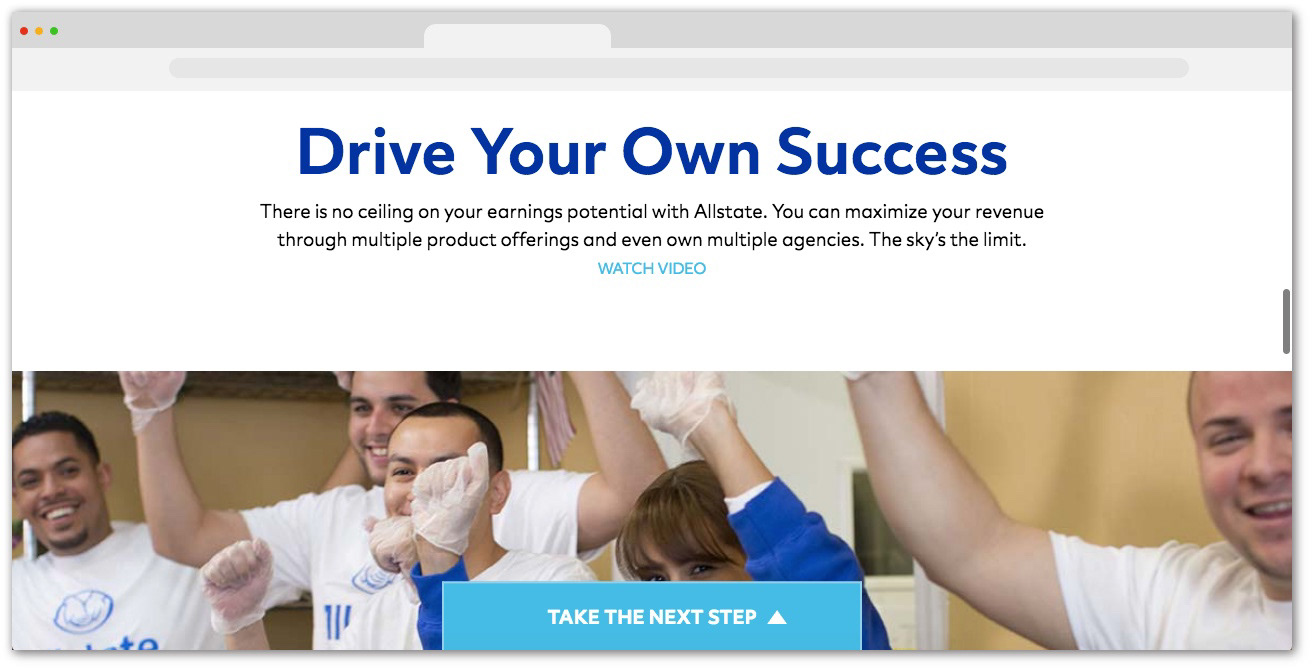
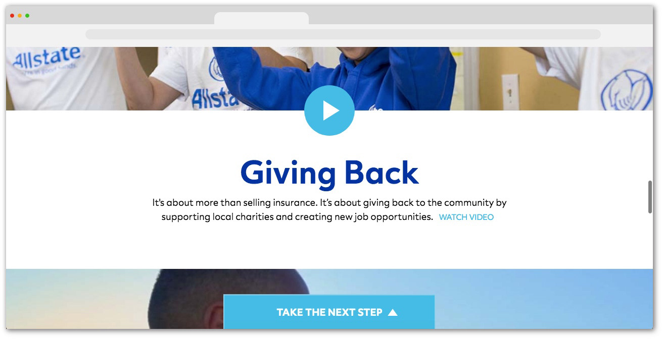
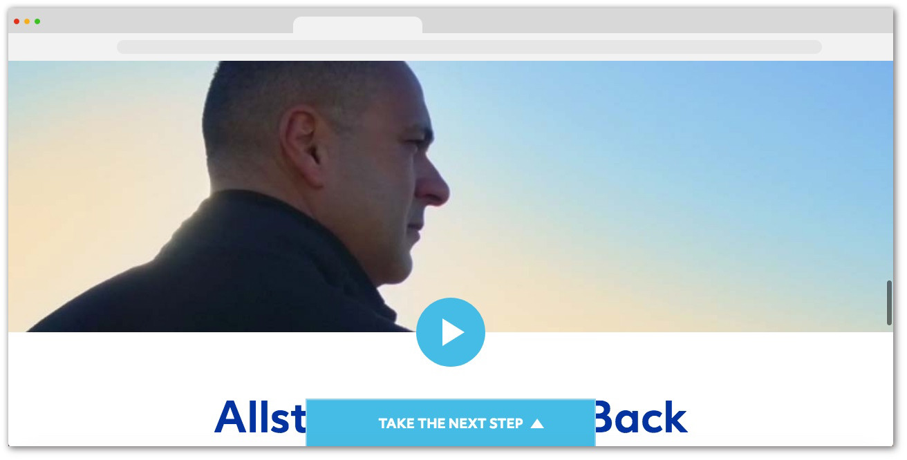
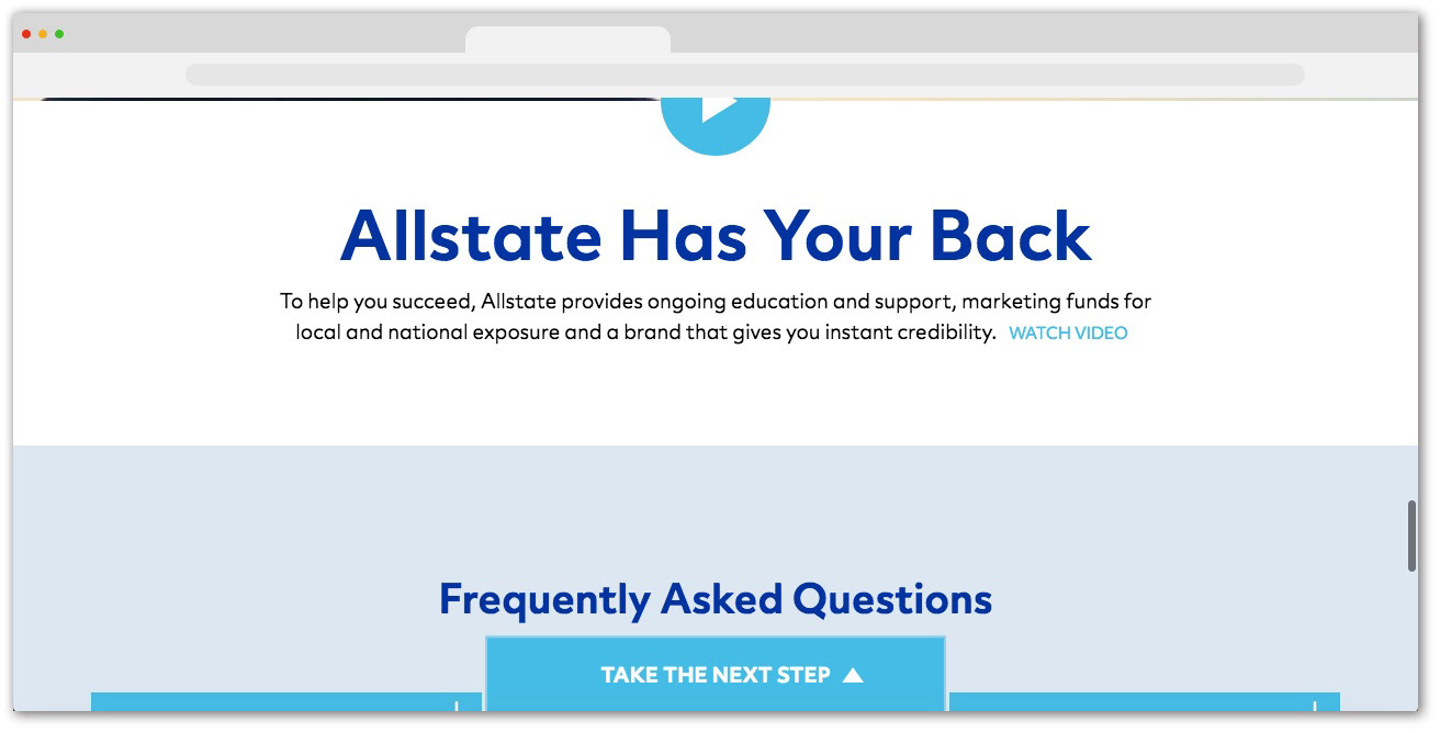
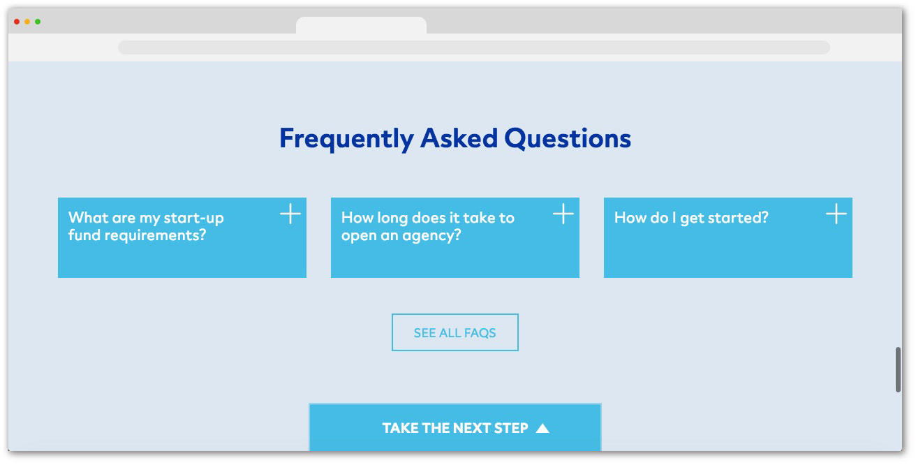
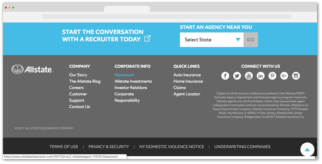
UX - Allstate Agent is a program under Allstate. Its aim is to connect people to Allstate agencies and assist them in opening an agency. It has its own online property separate from the Allstate main website that serves many functions related to Allstate Agent.
The home page consists of informational video content, promotional copy, an abbreviated FAQ section, and a tab pinned to the bottom of the page that expands once a user scrolls to the end of the page. This tab serves as both an agency finder tool and a link to contact a recruiter. The home page plays video content as an overlay and links to an ownership pdf, FAQ page, Opportunities page, and Contact Recruiter page by way of the pinned tab.
Each layer in the site map opened up in a new tab, which was unnecessary and disorienting. Their site was throwing users left and right to navigate around various content all under Allstate Agent. While the business was only estimated for visual design work for the blog, we decided to go a step further and address a UX problem we saw a solution for after our research.
Navigation Analysis
After analyzing the site's current navigation between sites and pages, I also analyzed the navigation in the blog, to see how it would fit in to our tentative solution.
Once we concluded this round of preliminary research, we figured out what needed to be done to make the most impact in the short timeframe we had.
Our solution was to consolidate all the pages of Allstate Agent into one site to foster a more cohesive user experience with Allstate Agent. I would do this by redesigning the navigation bar. The blog I was designing would fit right into our proposed navigation bar.
I created a new site map where all of the pages of Allstate Agent stem from the main landing home page.
Then I created a wireframe of what the new, optimized nav bar would look like.
With our suggested navigation, the various pages and functions of Allstate Agent would live under one roof, essentially in their own individual rooms. Whereas before, it was more like a duplex, where users had to go to a complete different online property to access specific pages under Allstate Agent.
After we addressed this area for improvement for the Allstate Agent overall online property, we moved onto the blog we were initially briefed on.
Wireframe Analysis
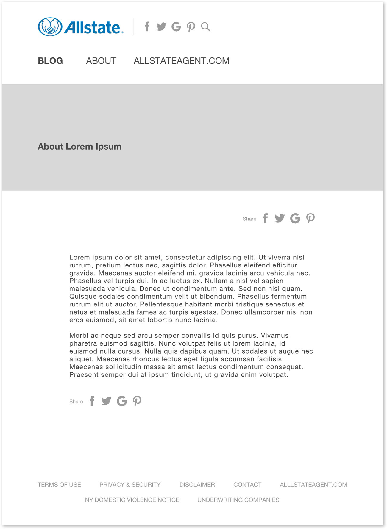
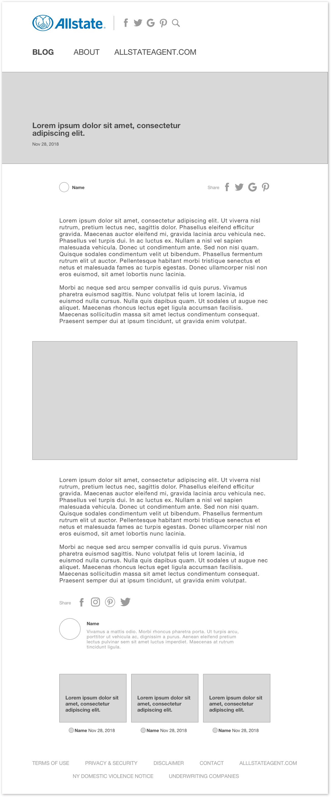
After receiving the wireframes from our UX designer, we analyzed them before moving on to styling the pages. There was an opportunity to consolidate 2 pages of the blog down to one. The About page consisted of a hero image and a brief paragraph that was an overview for the Allstate Agent site. We figured this single paragraph could be moved to the homepage after the hero image, serving as a lead in to the blog content. This would ideally give the site a leaner overall experience.
We also saw an opportunity to improve on the social share icons on the article page. In the wireframes, social icons are displayed in 3 different spots on the page - in the top nav, after the article, and in the footer. We learned that the social icons would link to 2 different types of social media. The top nav icons would link to the Allstate Agent social media accounts. Icons after the article linked to share the article through a user's social media account. We collapsed the top nav into an activity icon that could be opened and closed. We also displayed the icons in the footer. This meant the social icons would only ever be displayed, at most, twice on a page.

Style Exploration
Allstate provided a collection of photos to use from a prior photoshoot. I came up with 3 divergent, on-brand styles to present to the client. The style I lead with was my recommendation.

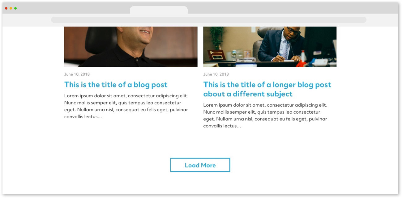
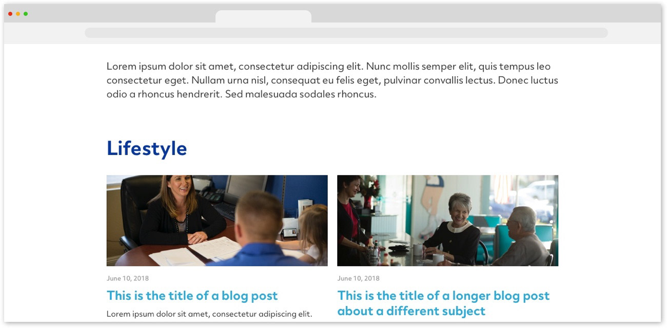

This style leaned into the Allstate main branding.

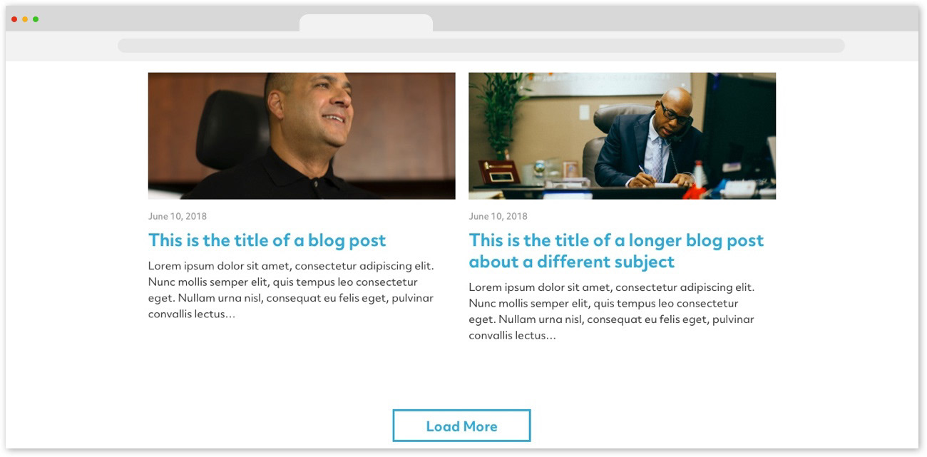

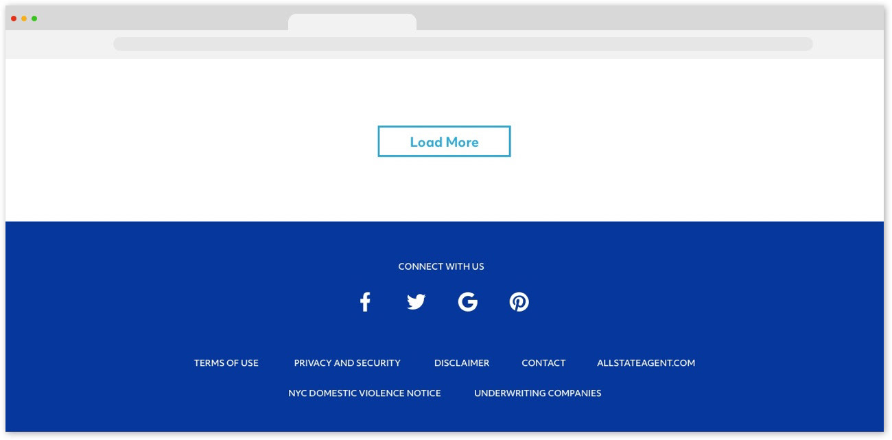
And the last style was a more minimal aesthetic.
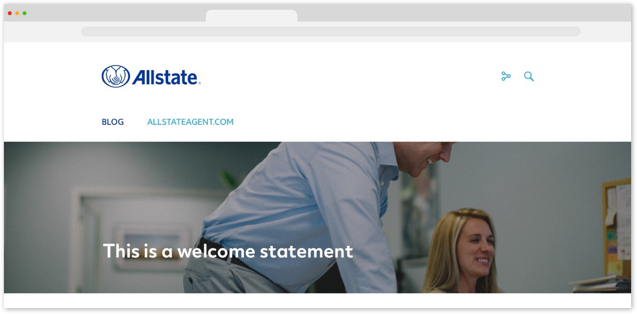
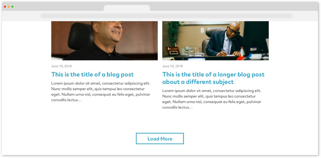


The client took my recommendation and agreed on the first style above. They took our top navigation suggestion to mind and liked the idea. For the time being though, they needed the comp to be sent to dev using the current version of the navigation, so that is what I provided. Before handing off to dev, I created a lite UI kit of the main interactions and their states.
This was my first project to get developed, and my first time working alongside a developer. It was really insightful to see the way they work with code relative to my designs and style direction. With my basic understanding of HTML and CSS, it was cool and insightful to see someone with a deeper knowledge of coding work. Seeing that side of things has definitely informed my overall design outlook for the better.
