GoActiv was a client simulation project I completed during my time at DESIGNATION. The intent of this project was to develop an iterative design process centered in UX/UI.
Wireframe Analysis
Below are the wireframes I received in the project brief. Habfit was the original name of the app concept. We were given ample creative liberty with this project, so in addition to re-designing and improving on the initial wireframes, I also came up with a new name.
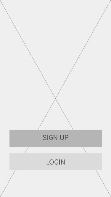
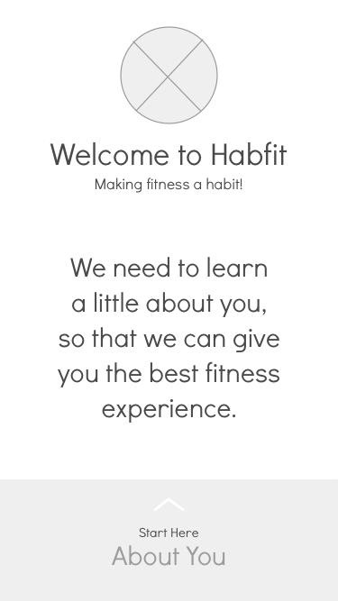
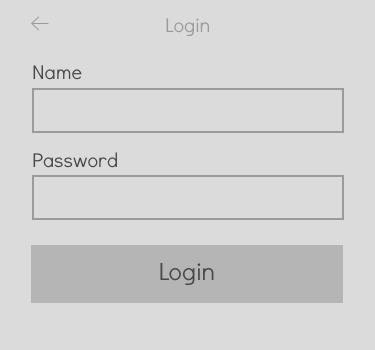
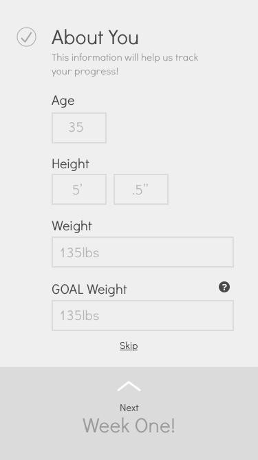
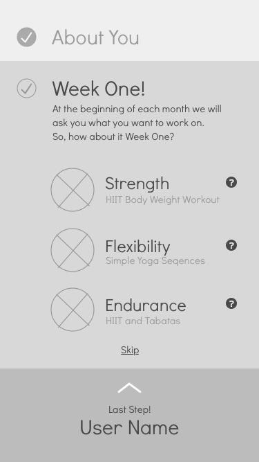
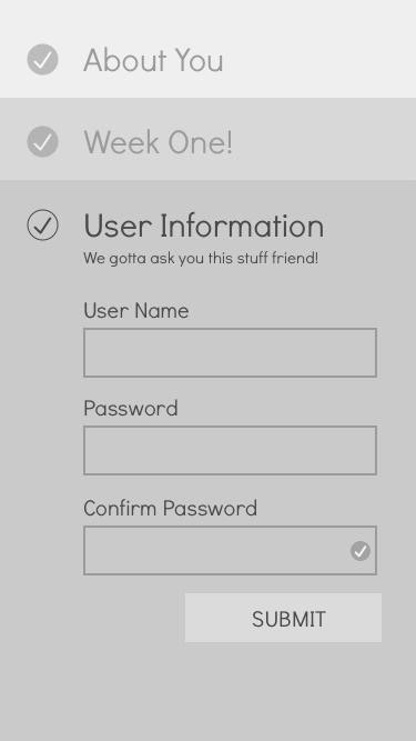
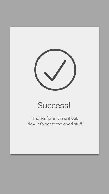
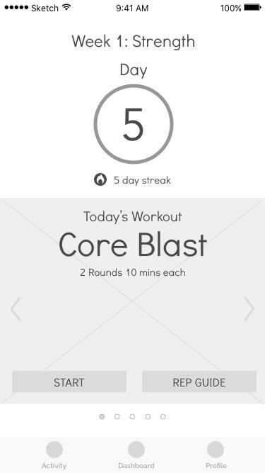
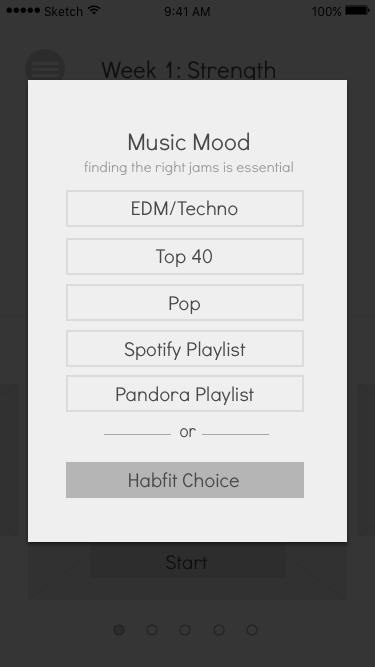
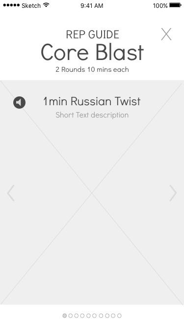
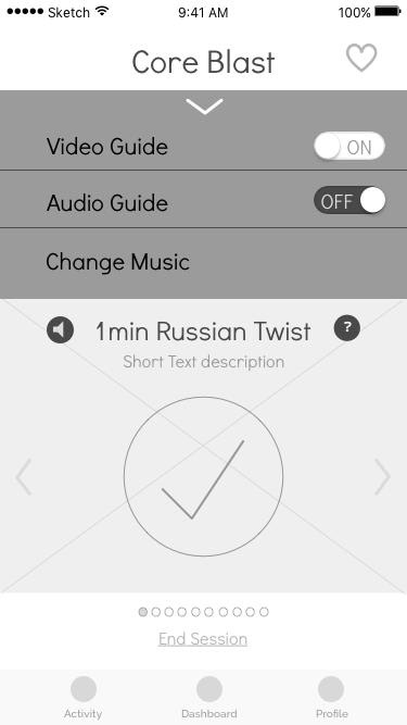
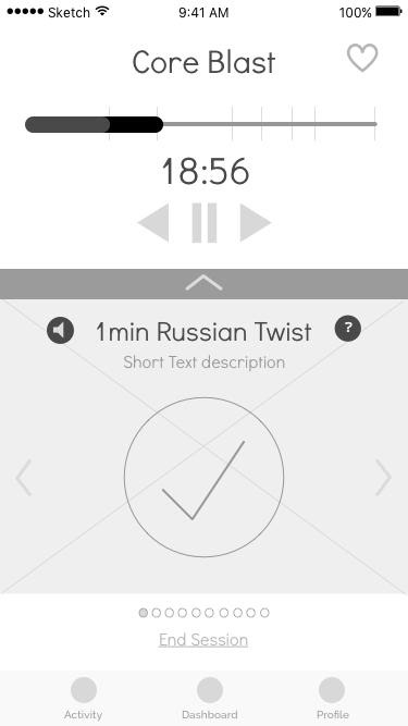
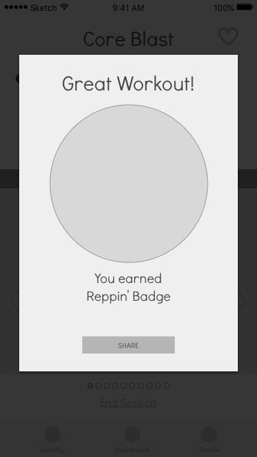
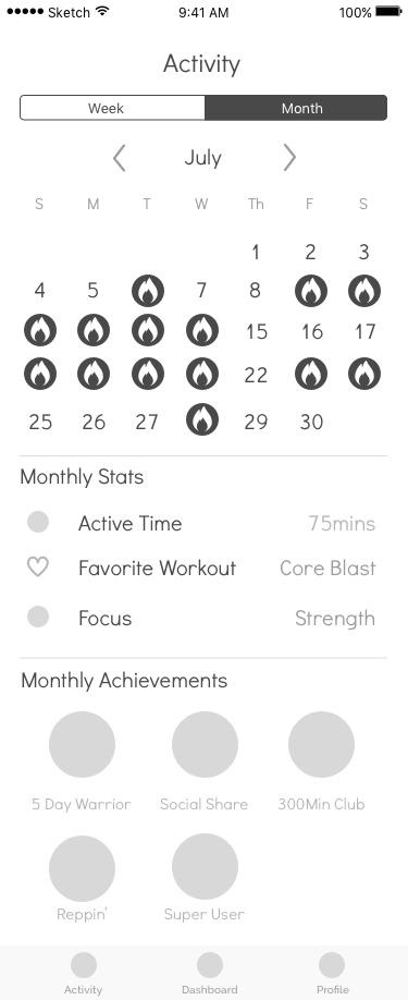
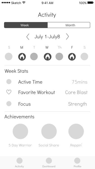
Habfit Wireframe Analysis
Onboarding Process: The onboarding process seemed to suggest that the focus of the app would be weight loss by way of fitness. The main focus of the app should be to get people moving and active on the go. There was also room for the layout of the onboarding section to be simplified.
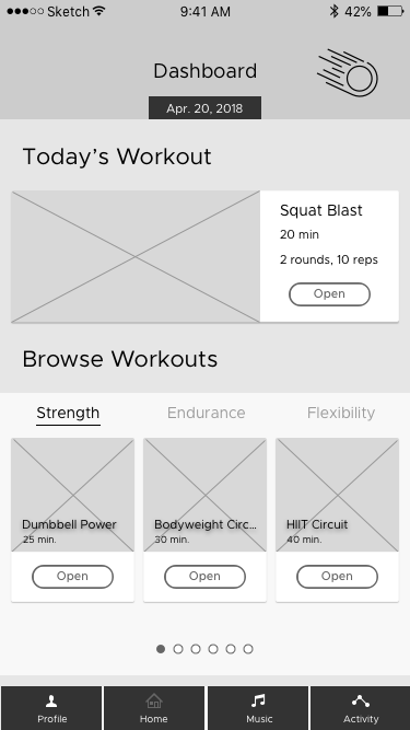
Dashboard: The dashboard served as the home screen. It was wasting space and amplifying trivial elements. By downplaying these elements, it freed up space to emphasize the featured workouts.
Workout Screen: The transition into the workout screen involved selecting a source of music before dropping into the workout. The workout success/completion screen needed work. It trapped users because there was no continuation or exit button. It also needed some clarification on ways to share user success through social media.
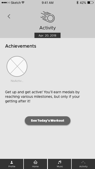
Activity: On the activity screen, there was room for better data visualization of the weekly stats. The achievements earned was congesting the activity screen, so to avoid cognitive overload I thought these would fit best on a separate screen. Same thing for the liked workouts.
After analyzing the original wireframes, I began my redesign.
Building GoActiv (Wireframes)
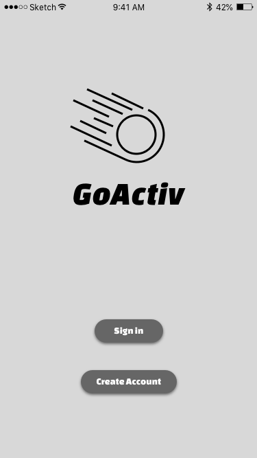
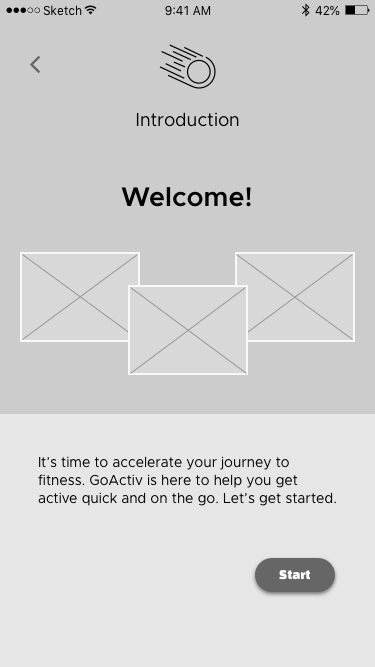
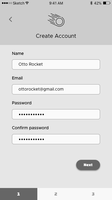
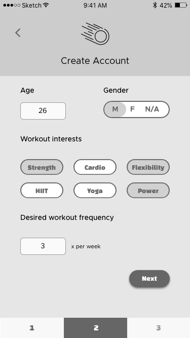
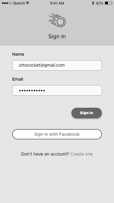
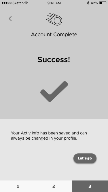
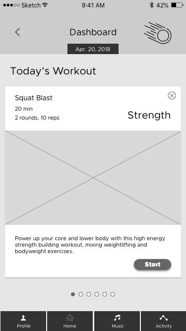
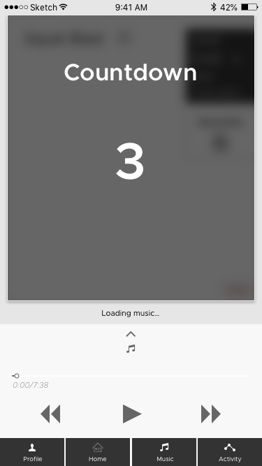
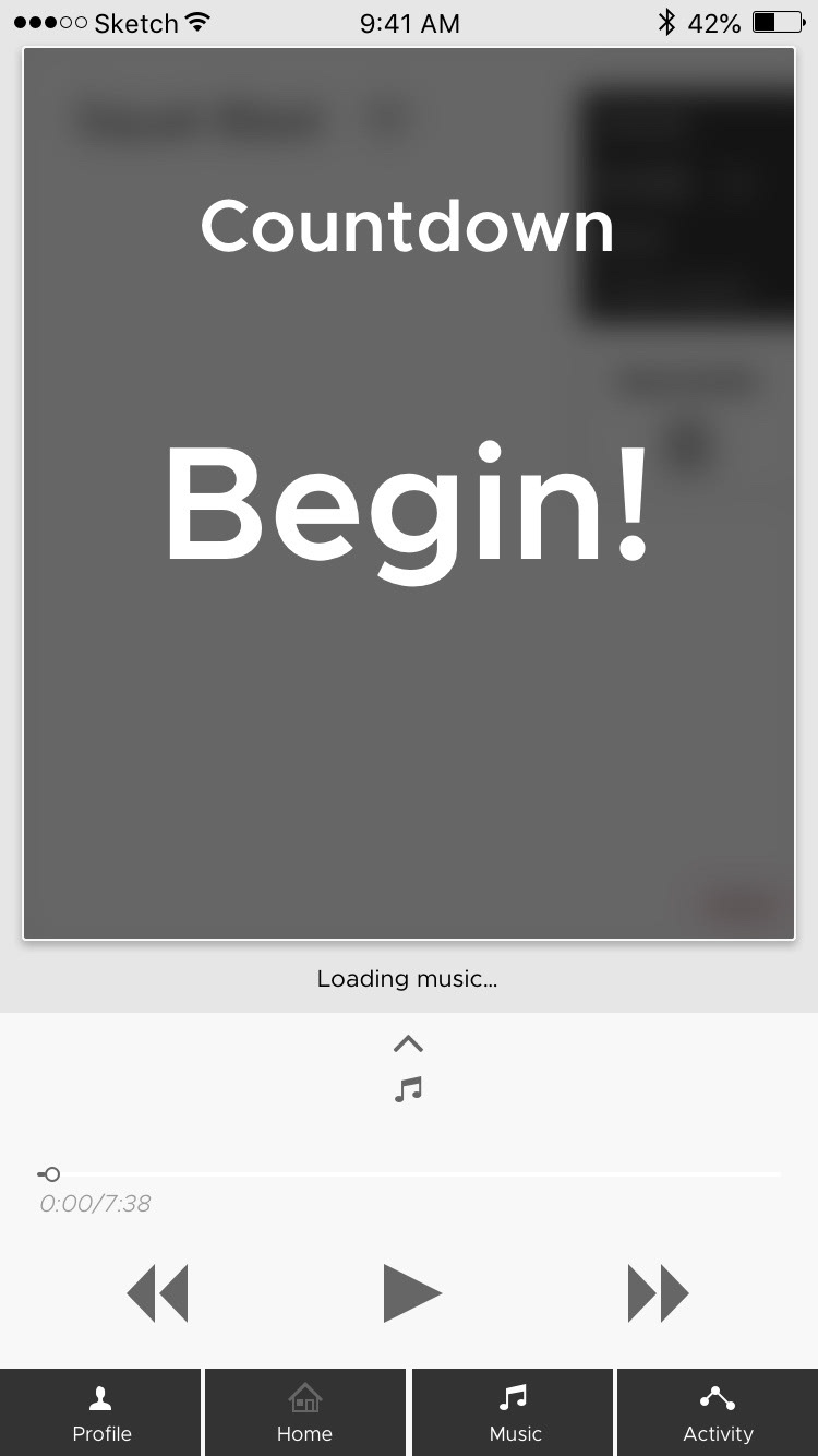
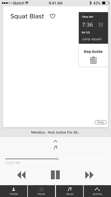
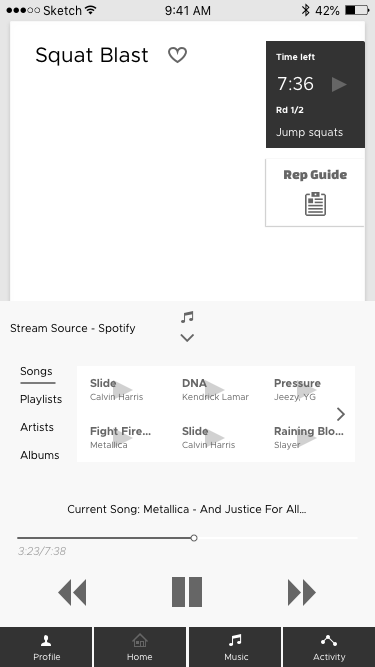
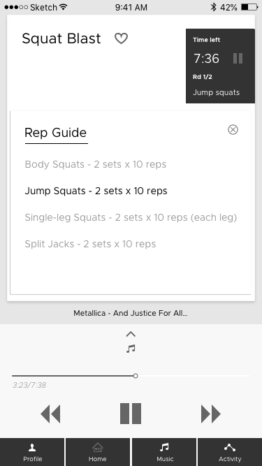
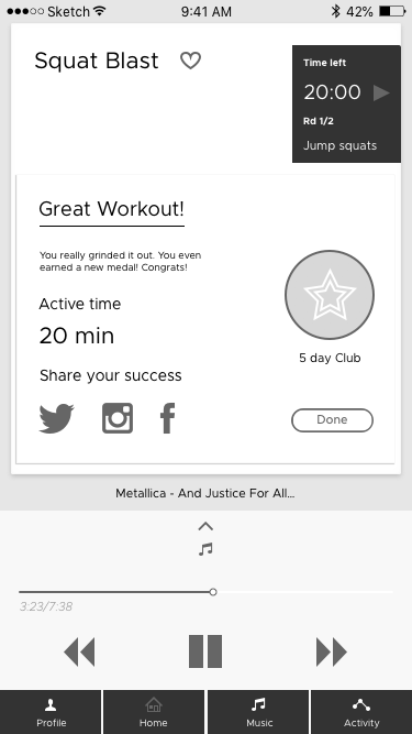
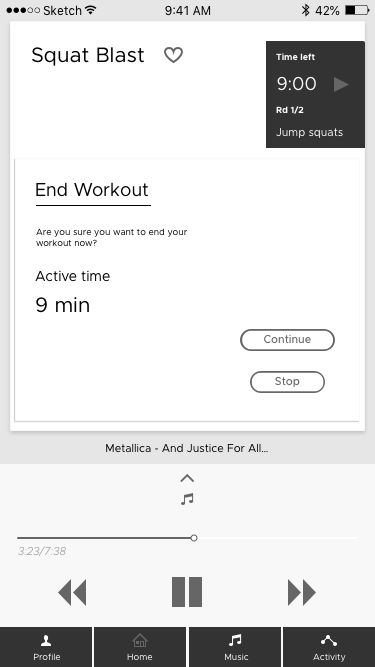
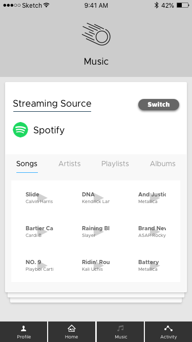
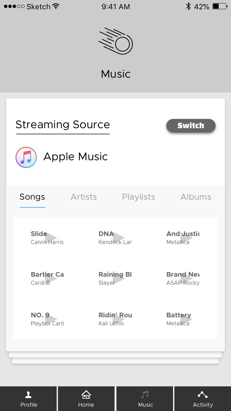

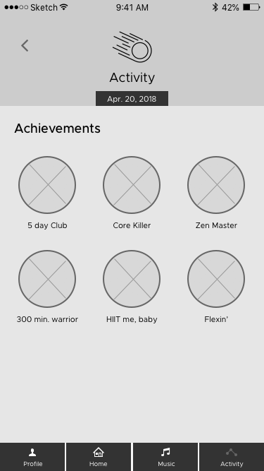
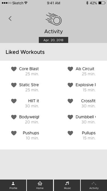
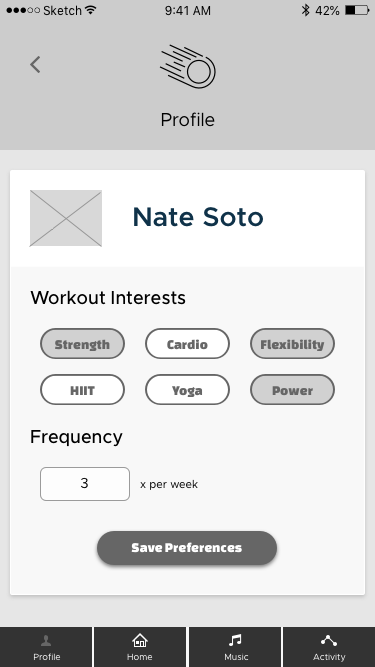
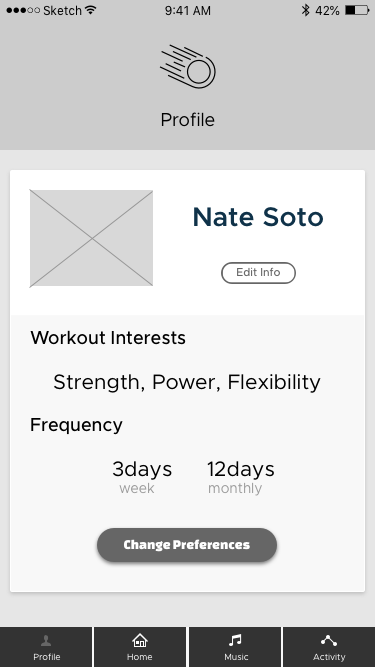
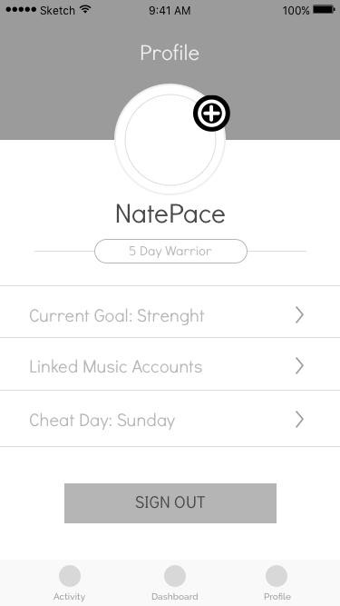
The main focus of the app should be to get people moving and active on the go. For this reason, I omitted the body measurements and goals from the onboarding process to shift the focus from body transformation to overall fitness goals.
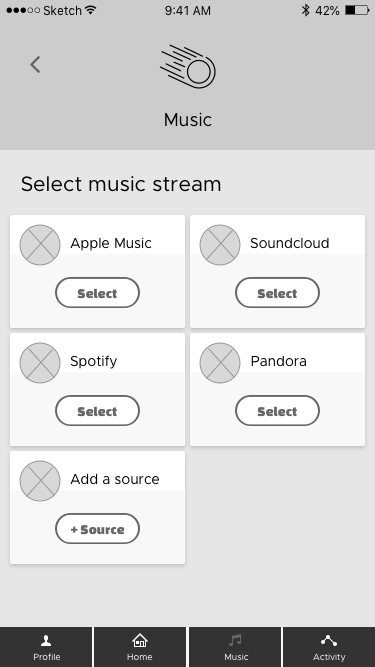
I figured that the workout music choice should instead countdown into the workout, so that the user is prepared and ready once the workout begins. I also simplified the music source selection step. It was taking up too much space that could be used for the video workout display.
I added various versions of the workout screen, and expanded on screens where need be based off my notes (above). I also re-purposed the onboarding process and added in the workout countdown screens.
Style Creation
With the wireframes updated, I moved on to creating a style for the app. I made a moodboard that drew inspiration from a blue sky and aviation. A blue sky on a nice day outdoors is naturally energizing. I thought this idea translated well to a fitness app where users would need to feel energized and engaged.
I then refined the moodboard into a style tile (below), outlining what some cards would look like, and other various UI elements.
GoActiv Style Tile
With the style tile, I created a visual style for GoActiv, so my next steps were to bring everything together and apply the style I created to the updated wireframes.
Style Application
I created the rest of the UI elements, established symbols and then pieced everything together on each different screen. You can see the hi-fidelity screens mockups below.
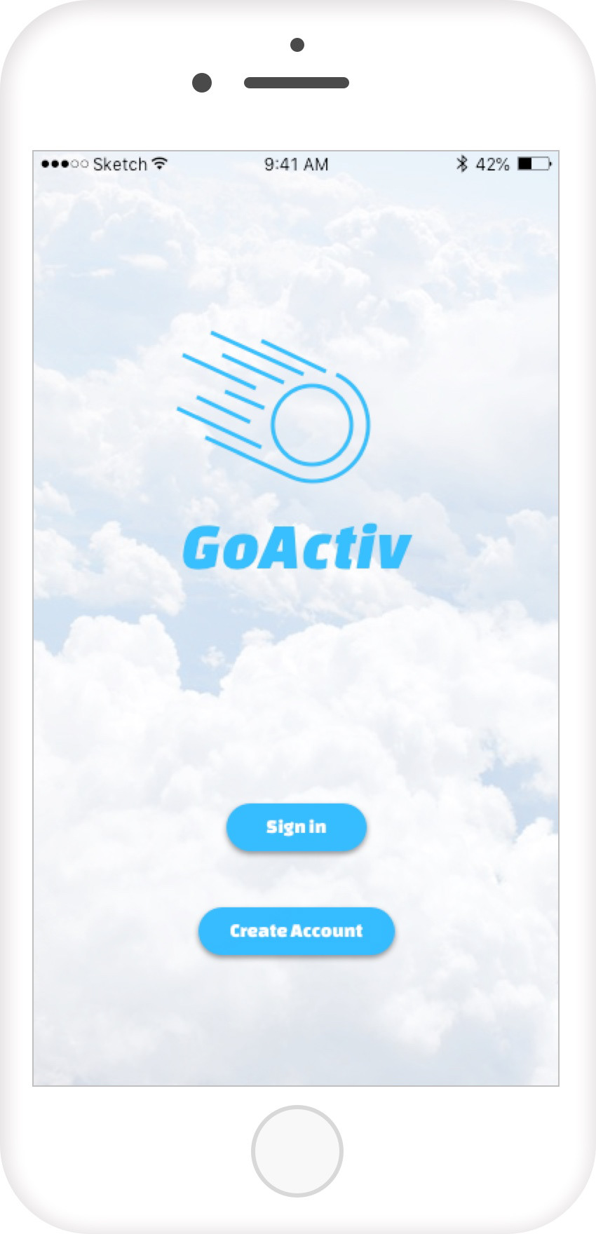
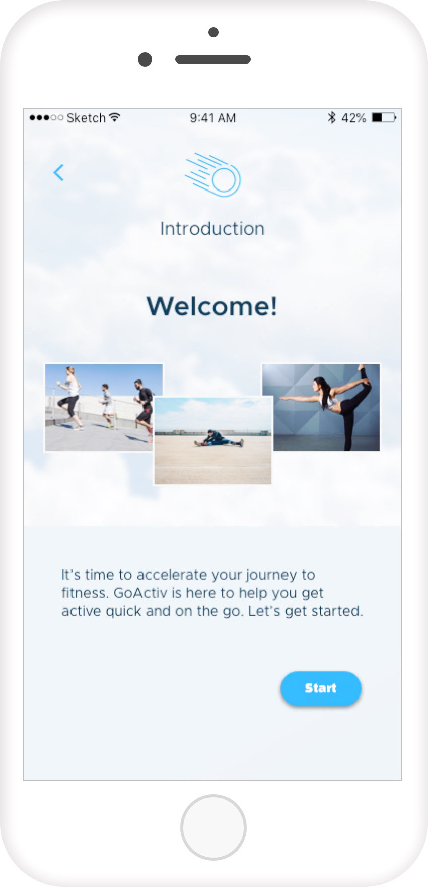
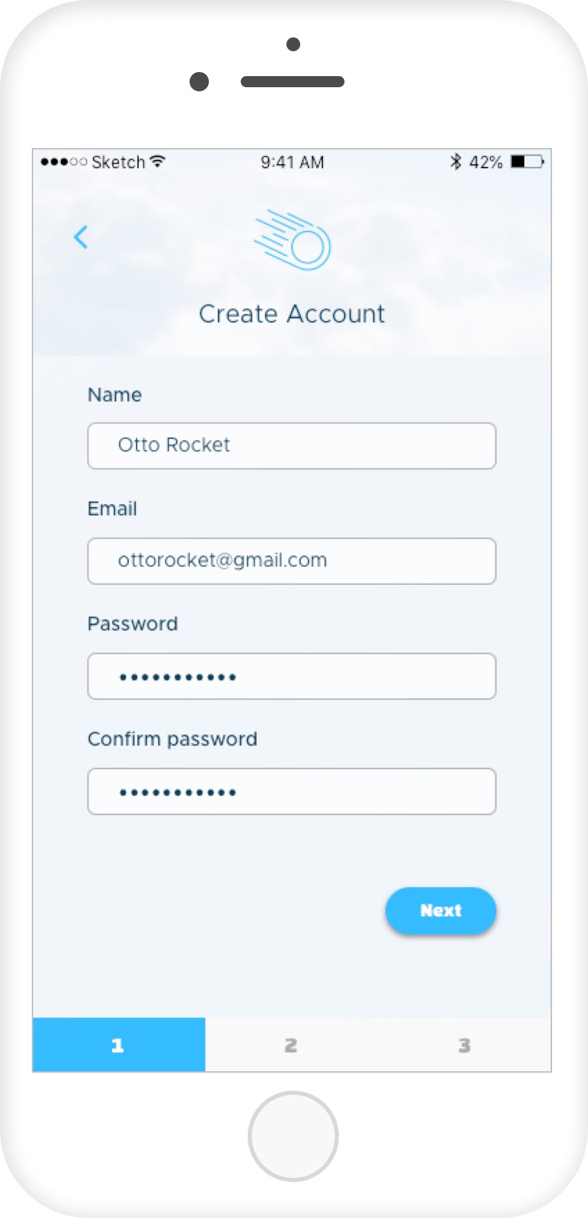
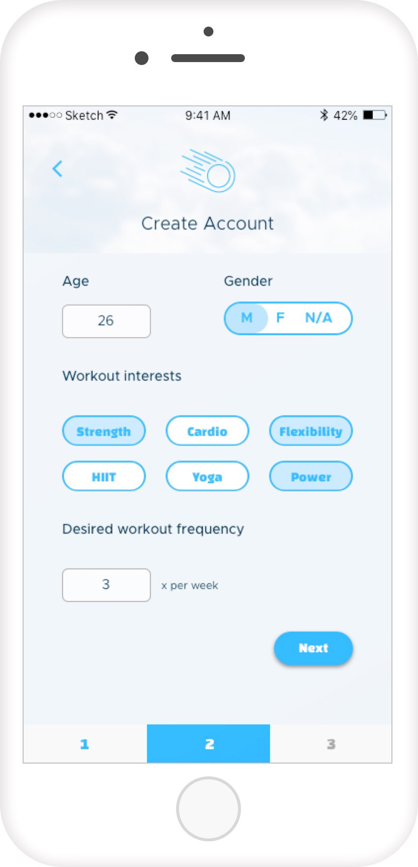
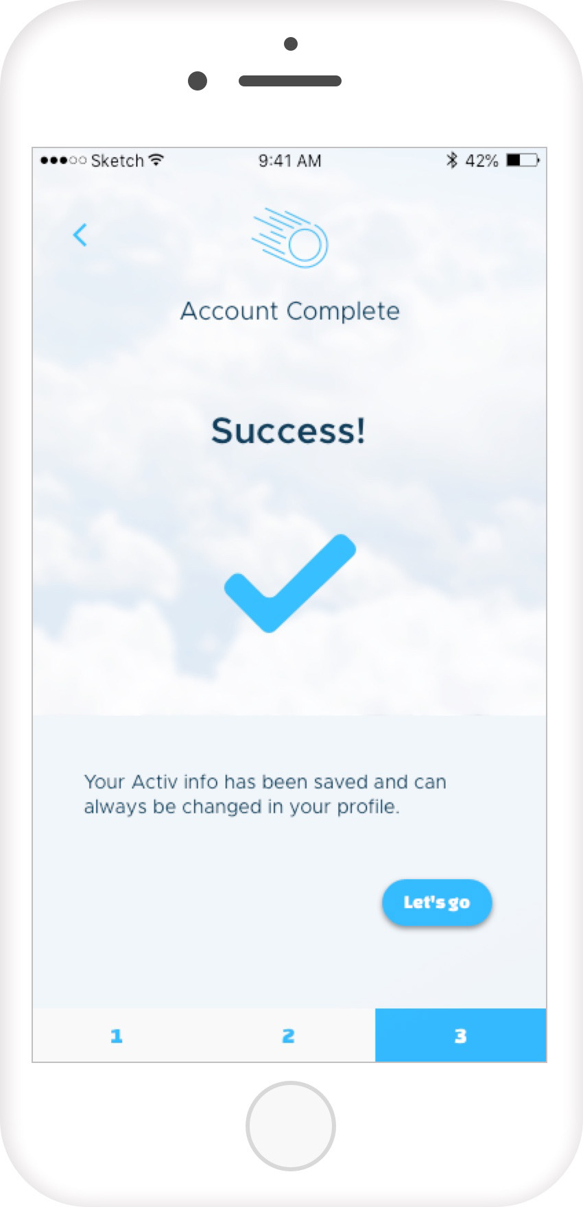
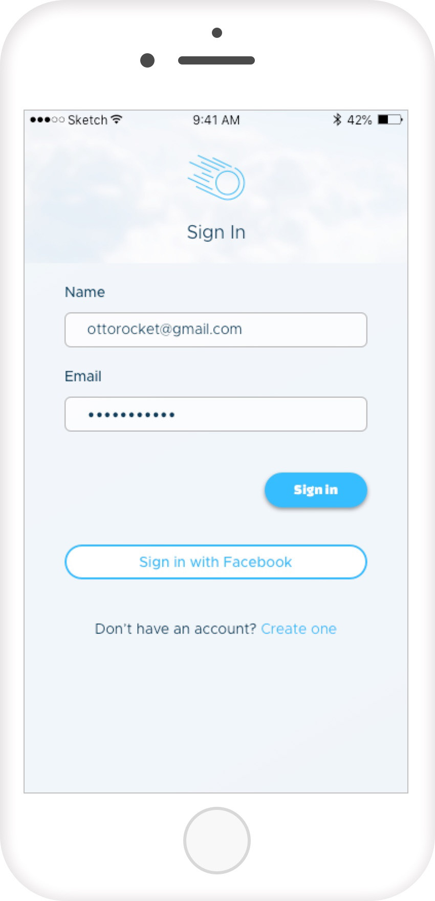
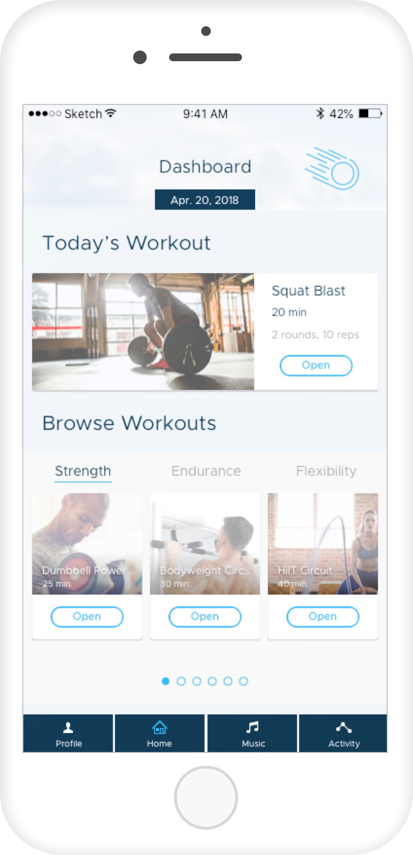
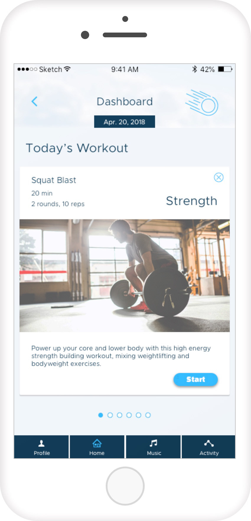
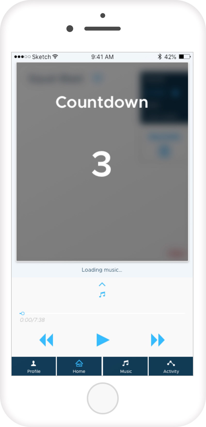
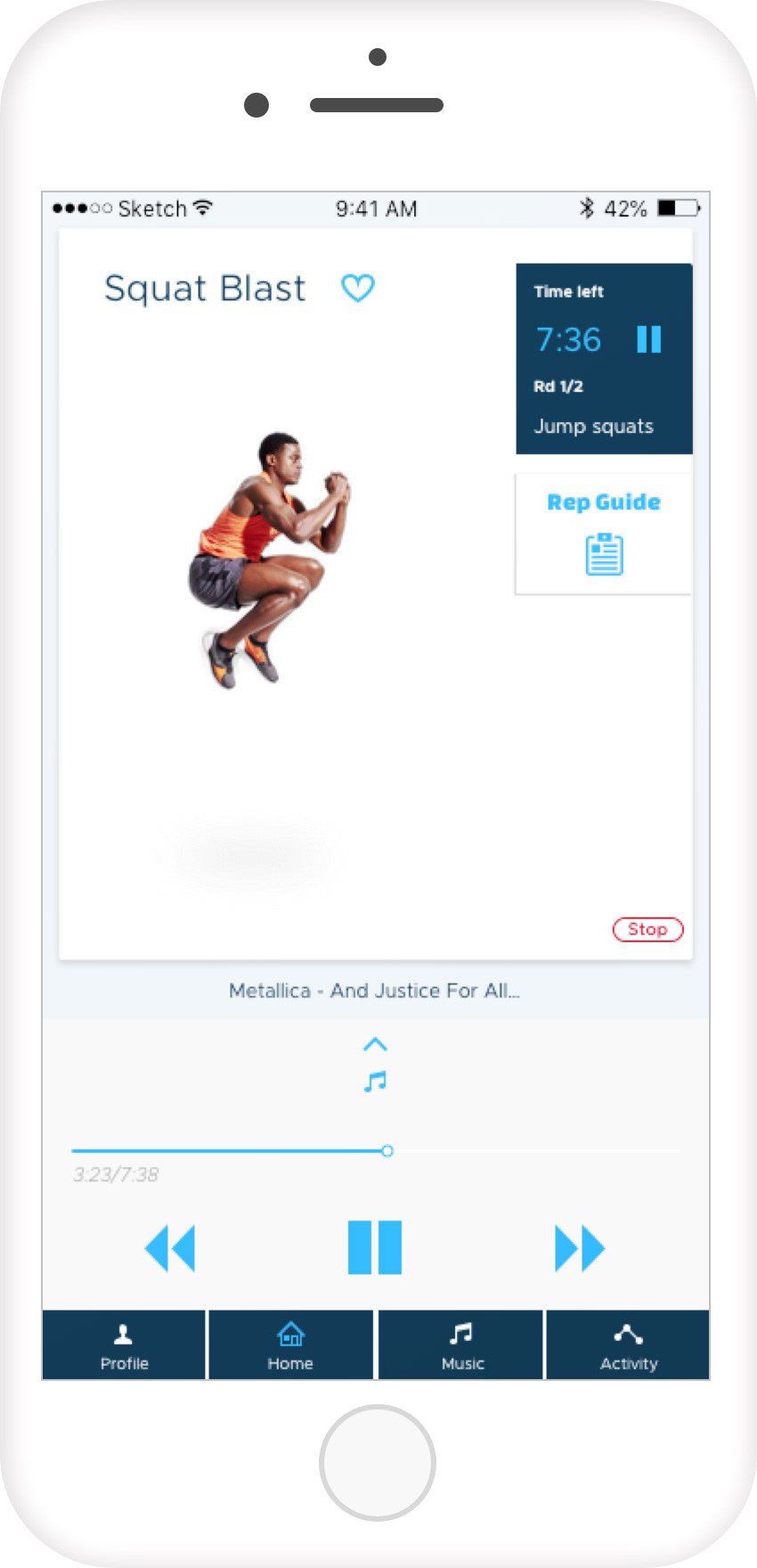
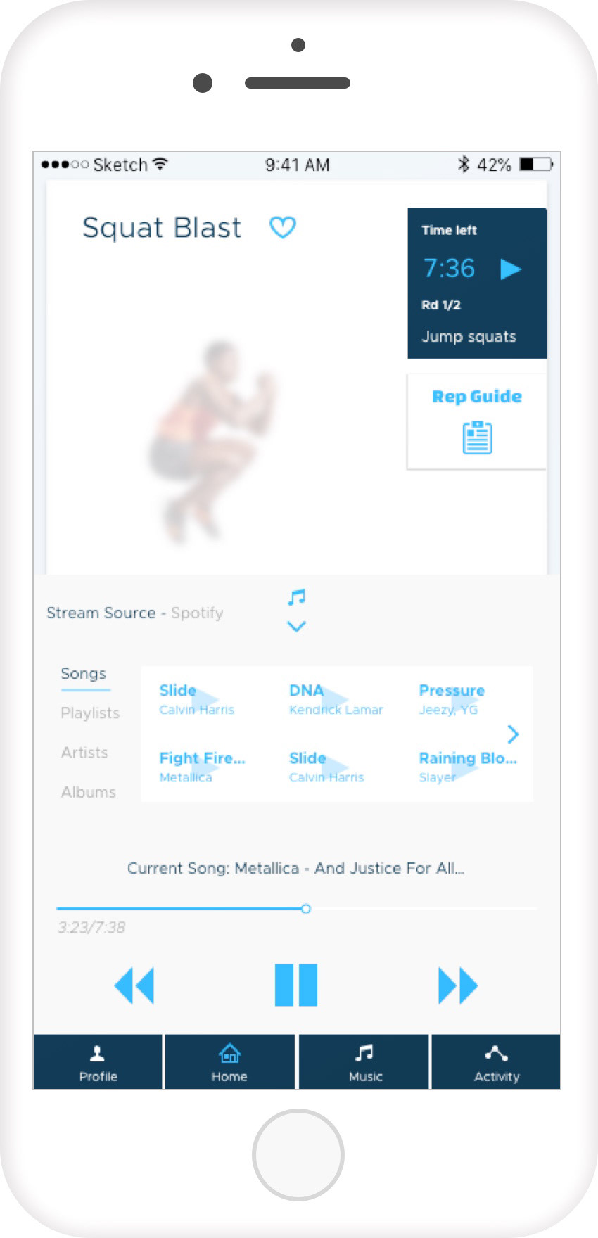
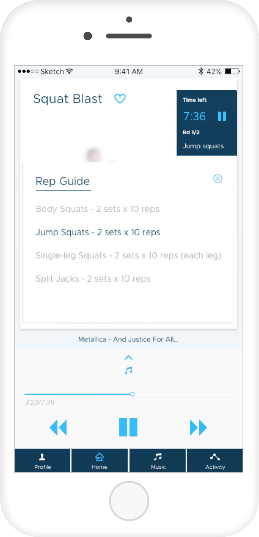
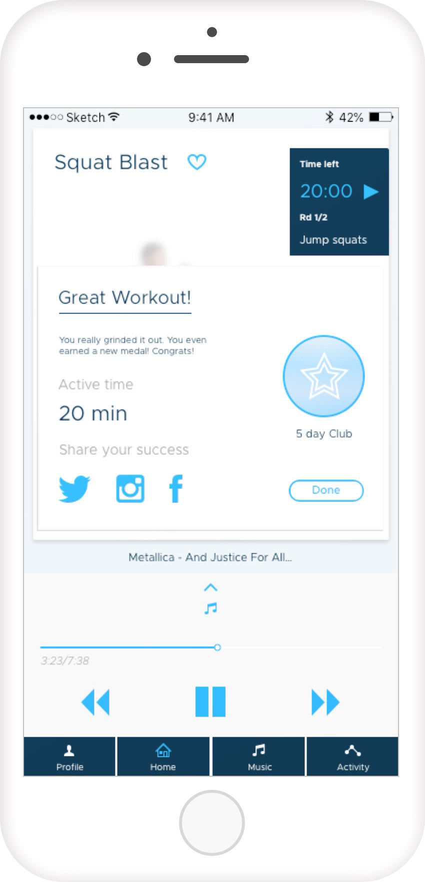
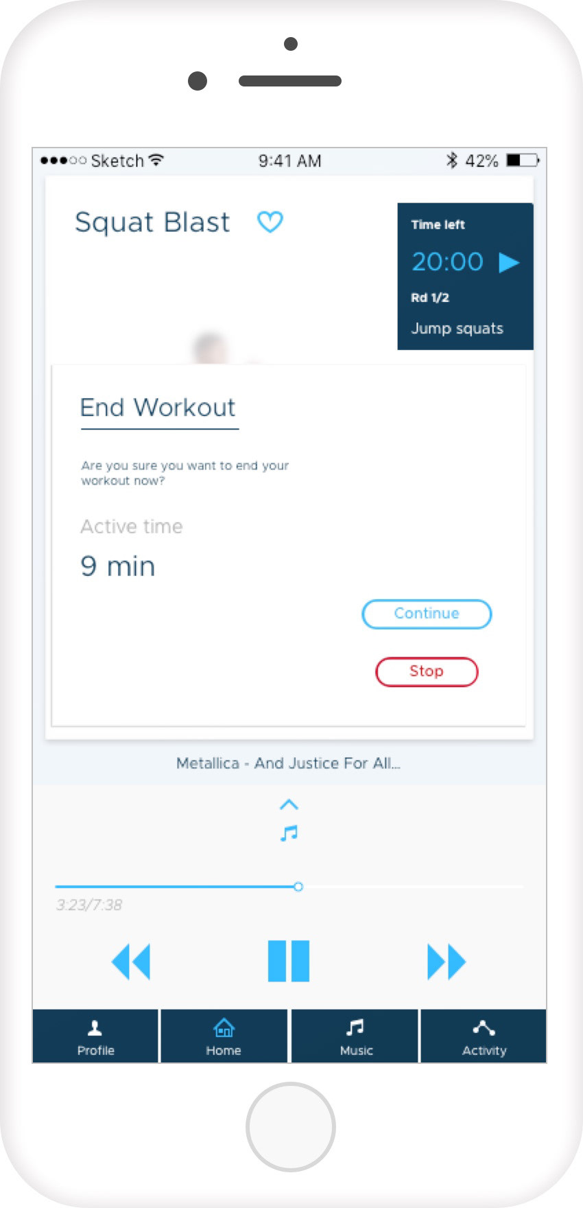
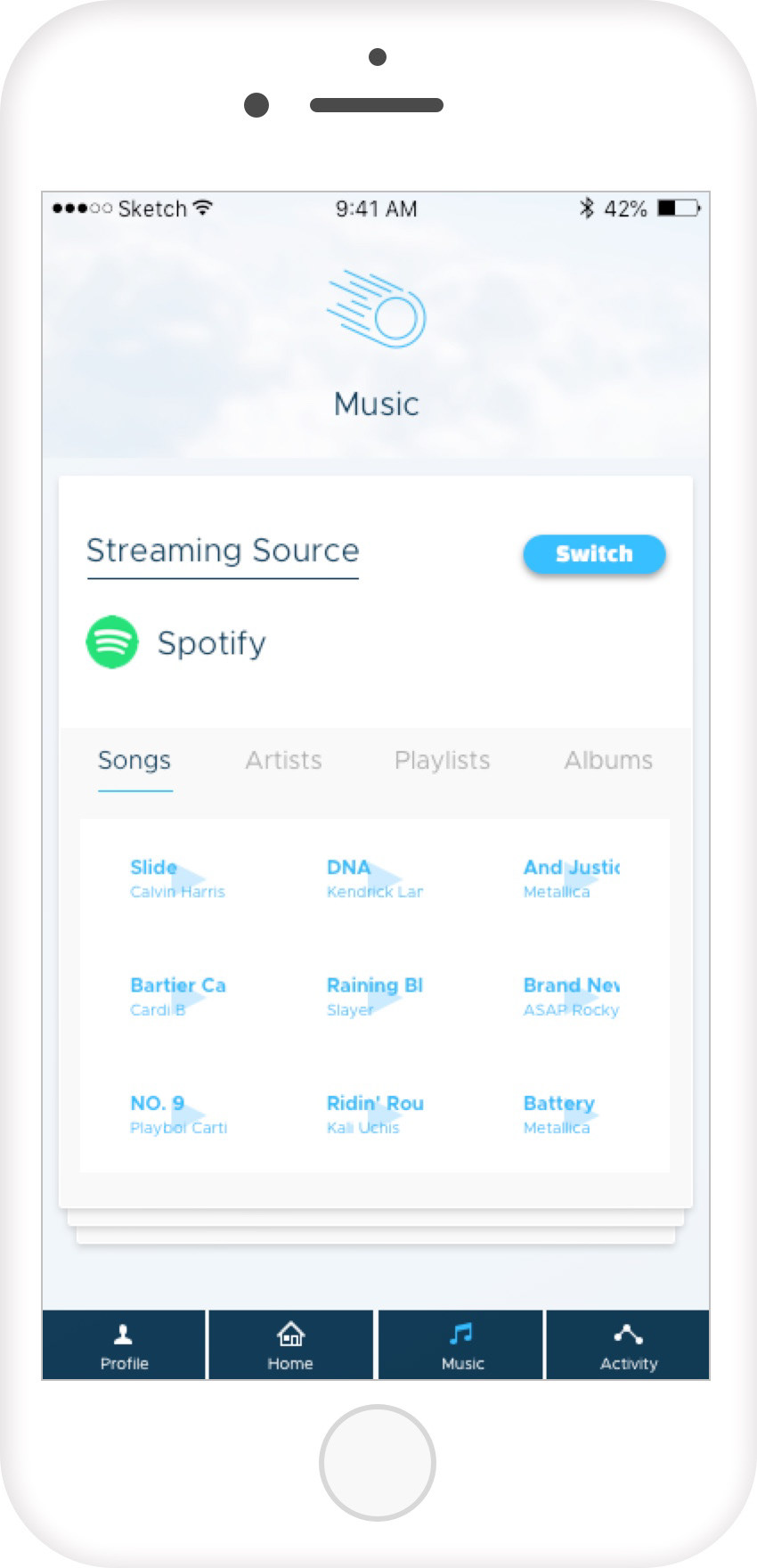
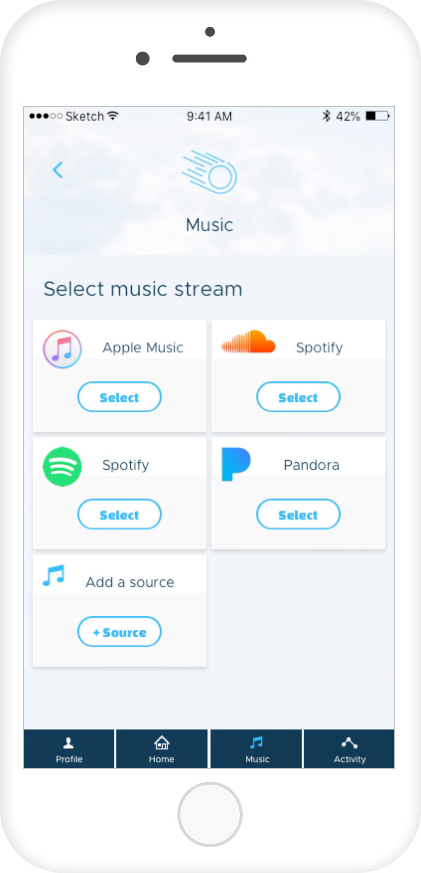
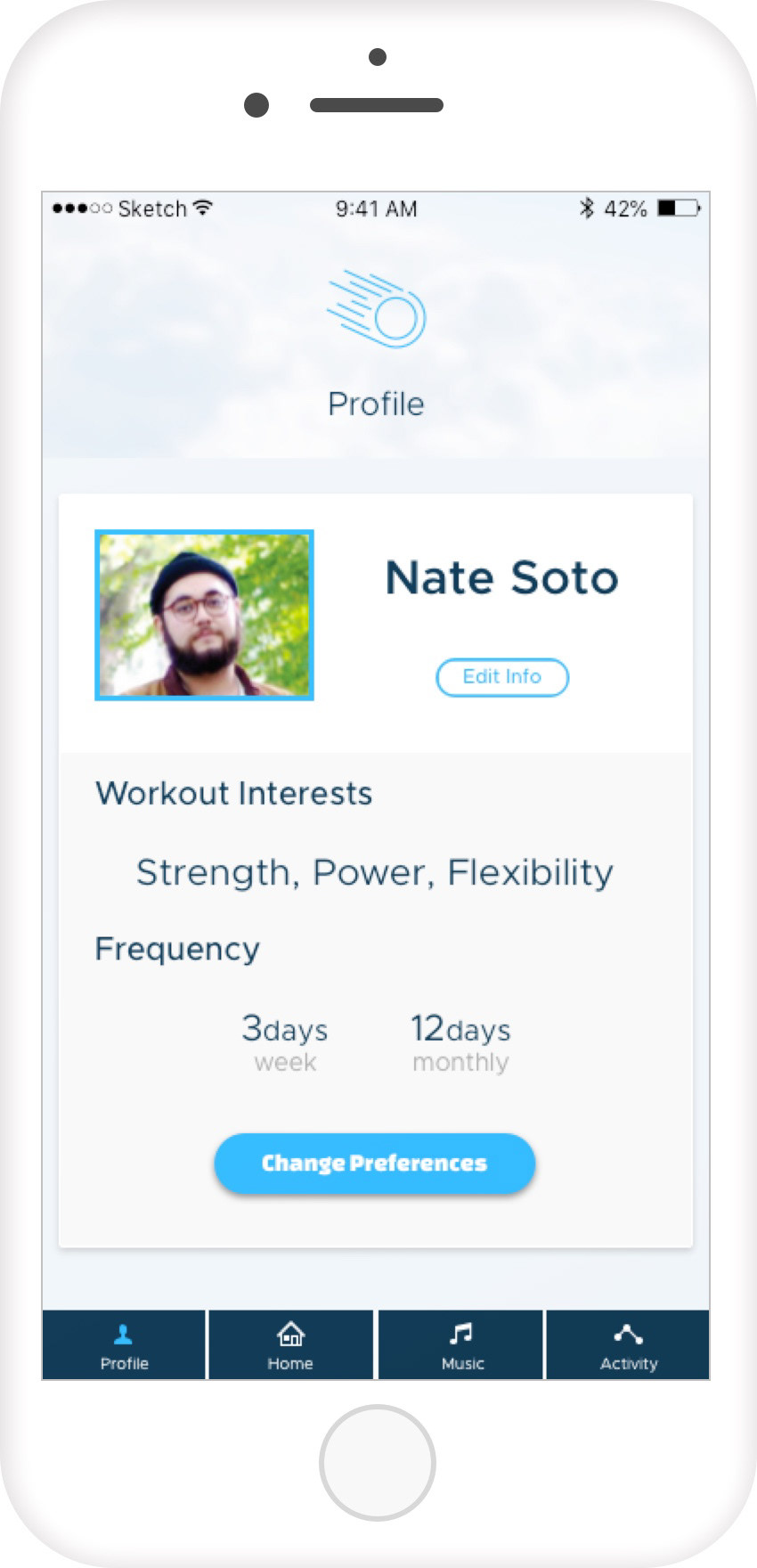
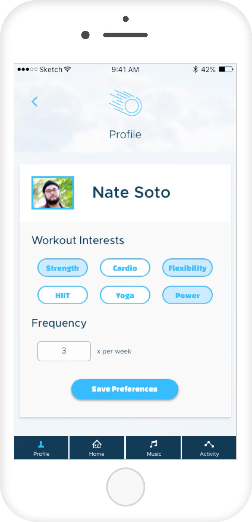
To see a run through of GoActiv in action, I connected the screens and made a basic prototype in InVision.
GoActiv Prototype
This prototype takes you through the main user flows in the app: onboarding, workouts, music, activity, and a user profile.
Conclusion and Takeways
Going forward, I think I would like to dive into how the music stream sources sync to the app. It's an idea that, to be successful, needs to be researched thoroughly to prove how plausible it may or may not be.
With this being one of my first experiences with this type of creative process, I soaked in a lot about design sprint format and how to work in one. Redesigning the wireframes was a fun challenge for me. Figuring out design solutions to better display content and information feels like solving a puzzle. As someone who enjoys solving Rubik's cubes, the satisfying aspect of solving a puzzle is something I felt as I redesigned the wireframes. I also learned a couple new techniques for creating color palettes while working on this project, which proved to be another satisfying part of design for me.
