Kellogg's Family Rewards (KFR)
Role:
UI/UX Designer
Background
Kellogg's Family Rewards is a consumer relationship management initiative that promotes Kellogg's brands through various types of content. By collecting points, redeeming them, and staying up to date on all the latest deals and offers, KFR's system, in theory, engages their consumers regularly, ultimately driving product sales.
I received some preliminary high level UX research from my design director on the program in the form of a journey map and site map, This helped me get a better idea of KFR's purpose.  
Out of KFR's digital products available (website, emails) they have some consistent content pieces between both, which can be seen in the site map below. The program features a few different types of content, all of which either drive sales or promote loyalty to the program. 
The Ask

A redesign of KFR’s digital presence and outreach, starting with a redesign of the homepage and their weekly emails.
The client only knew that their emails and website were visually unappealing. They weren’t quite aware of their overall user experience so it was our job to diagnose those problems and remedy them accordingly.
Website (scroll-through screenshots)

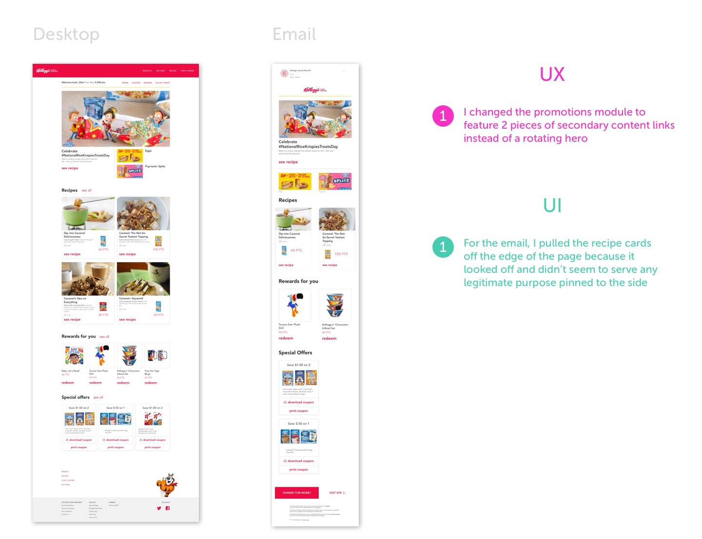
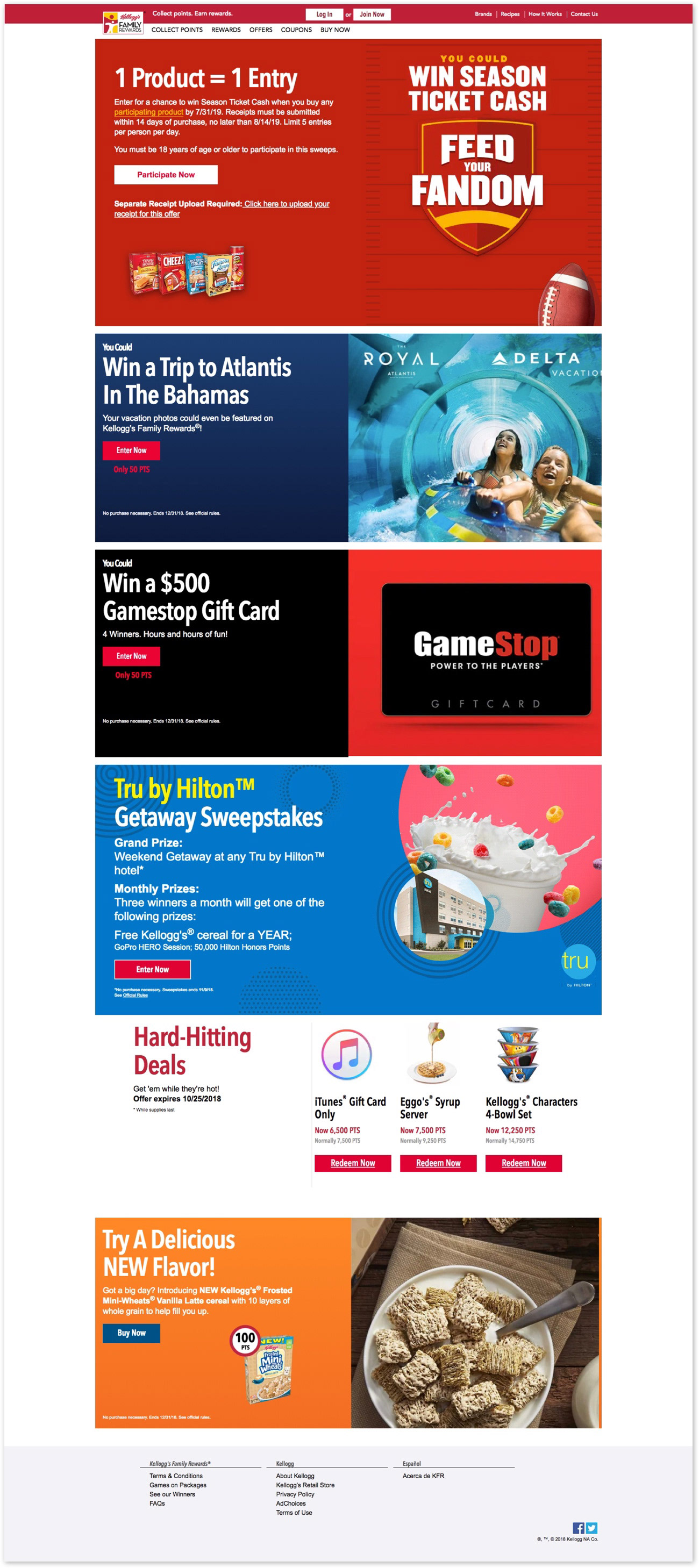
These screens represent various views of the homepage when scrolling through.

This is a separate content module of a different type, entering a sweepstakes. 

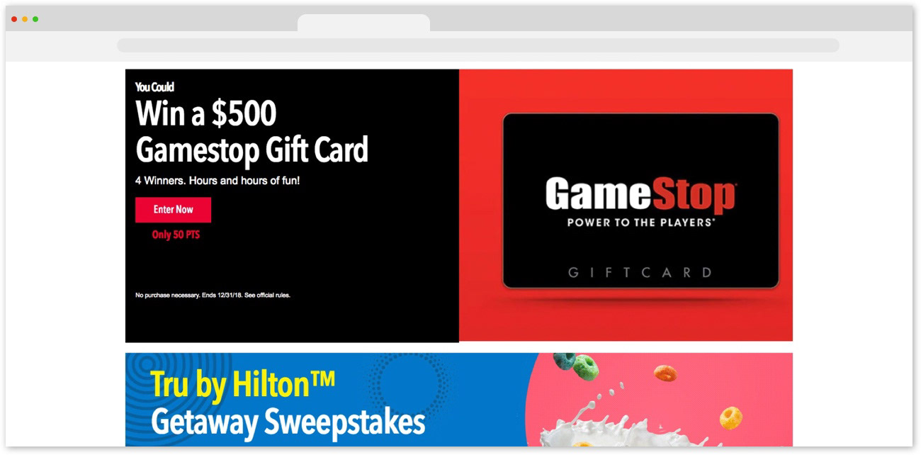
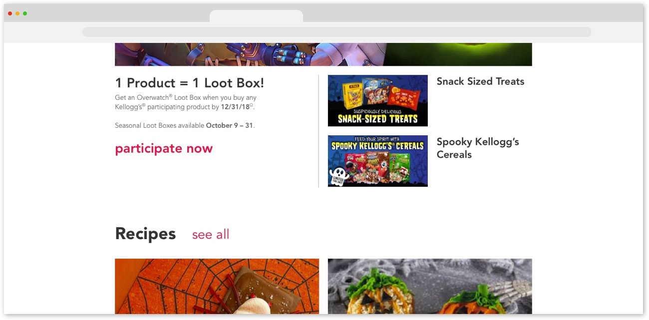
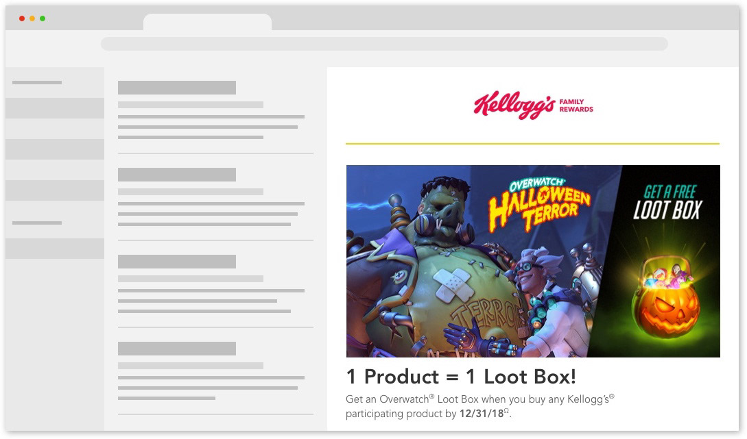
The GameStop module is a promotion in tandem with the above Delta sweepstakes. 

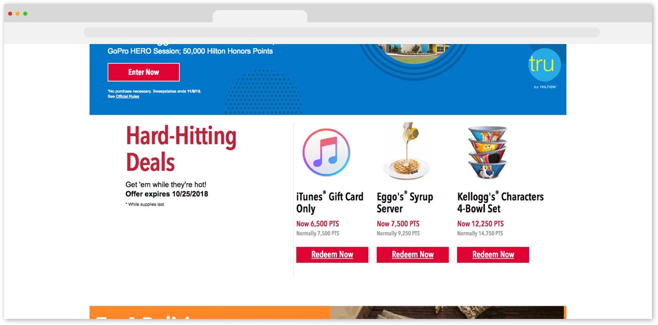
This is a time-sensitive, exclusive rewards offer thrown in between other promotional content.

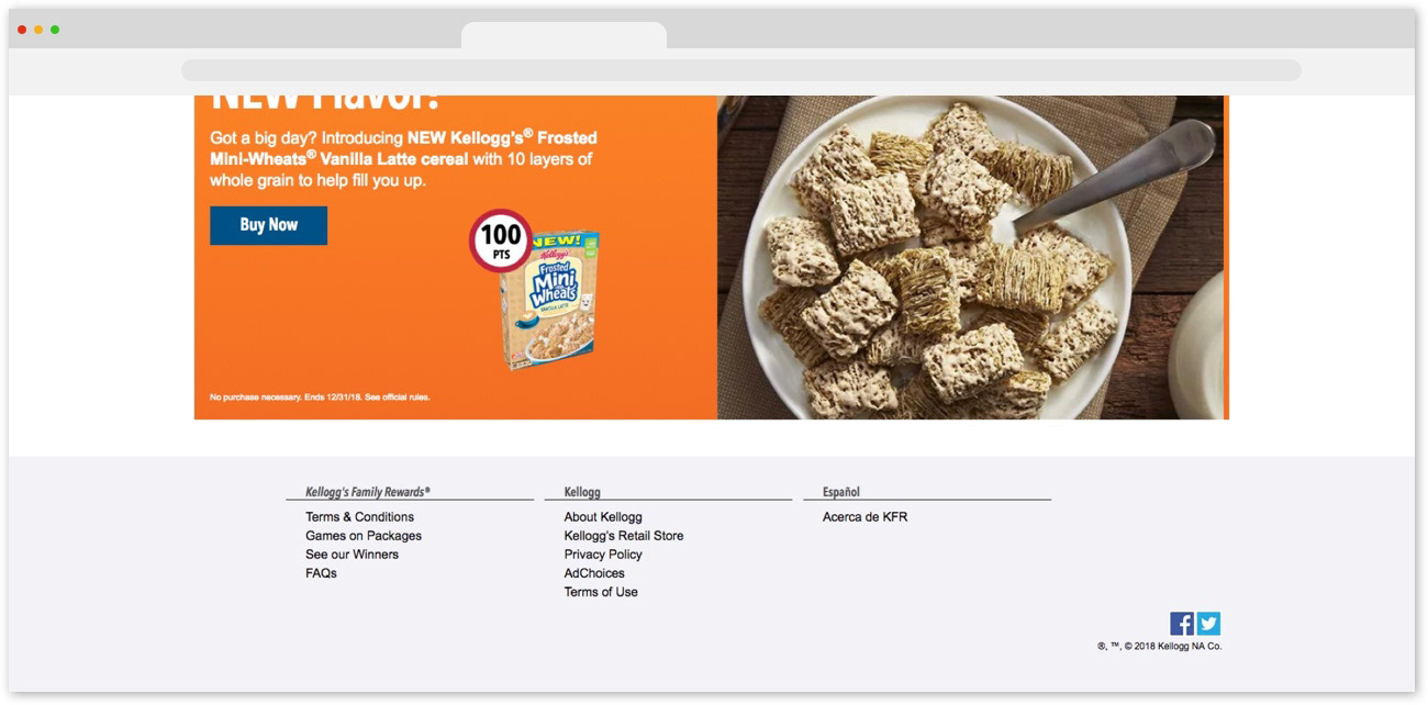
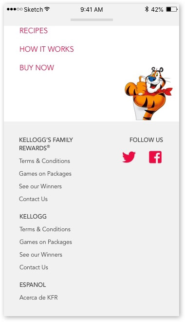
And this concludes the homepage experience, with one last product promotion and cta.

Email (scroll-through screenshots)
Below are screenshots of one of the original emails that went out on a weekly basis. The theme for this email was Halloween. I followed this theme in creating my redesign. 
Assumptions

We made a few assumptions after an initial glance at the site and email, before getting into our deeper UX analysis of the program.
The clutter of the homepage is the source of a lot of the site's issues.
The issues of the site carry over to the emails
After I made these assumptions, I moved onto conducting a UX evaluation. 
Additional Considerations

The KFR program features weekly emails and runs on a thematically curated content calendar. Our solution would not only have to solve KFR's visual issues, but also optimize the workflow of the whole process between various stakeholders and teams involved.
I also made it a specific goal of mine to design an adaptable system that communicates a visual voice and tone based on the theme. This would help our art direction team better execute their visual content through our design system.  
Heuristic Evaluation

I performed a heuristic evaluation of the site and emails based on Jakob Nielsen's Heuristics for User Interface Design. Out of all of my notes, I drew some general takeaways related to the UX.  
I also did a visual aesthetic analysis on the UI. 
Key Overall Takeaways
The site/emails are cluttered and is a content overload at the forefront of the experience
The UI patterns used are dated and clunky
Homepage content needs to be organized and consolidated, and its currently a platter of every type of content
With so much image heavy content, it needs to play up on the appetite appeal and visual focus yet stay organized and not overwhelming
A visual hierarchy needs to be established
It's not designed for mobile and should be
User Observation

With the rolling timeline and constant deadlines to meet, we didn't have much time for testing and had to conduct brief interviews and observations on the fly. We relied on open-ended research questions to gather qualitative data about the site. We led them through the screenshots of the homepage above and asked them what they would do upon landing on the page, and asked them to complete a few basic tasks.
Users were being front loaded with a multitude of different types of content. There wasn't much affordance offered from the site in terms of where the user is and what they should be doing at that moment. 
Based on our research up to this point, I hypothesized our users would be more susceptible to paradox of choice, where they're given so many options that they ultimately don't make a decision and abandon the page altogether. 
After consolidating all our notes from the UX evaluation and round of testing, we had a better idea of what issues needed to be prioritized and the direction we needed to go to make the most impact quickly.
We then implemented some design principles to keep us on track. 
Design Principles
Let it breath - With so much content, the emails and site appear cluttered, we need to utilize white space to effectively compliment our image heavy content strategy
Curate the Content - Content shouldn’t be a crap shoot. Different types of content should be presented under their own categories at the forefront of the experience to lead users through KFR effectively
Brighten it - KFR has an outdated UI. We should utilize the best patterns for our content where fit and update branding to better match Kelloggs main branding 
After I established these principles to follow throughout the process I created hi-fidelity wireframes.
Hi-fidelity Wireframes

I utilized varying card patterns and organized them into their own categories to solve the over clutter issue. This also helped better curate the content throughout the entire page.
Website (scroll-through screenshots)

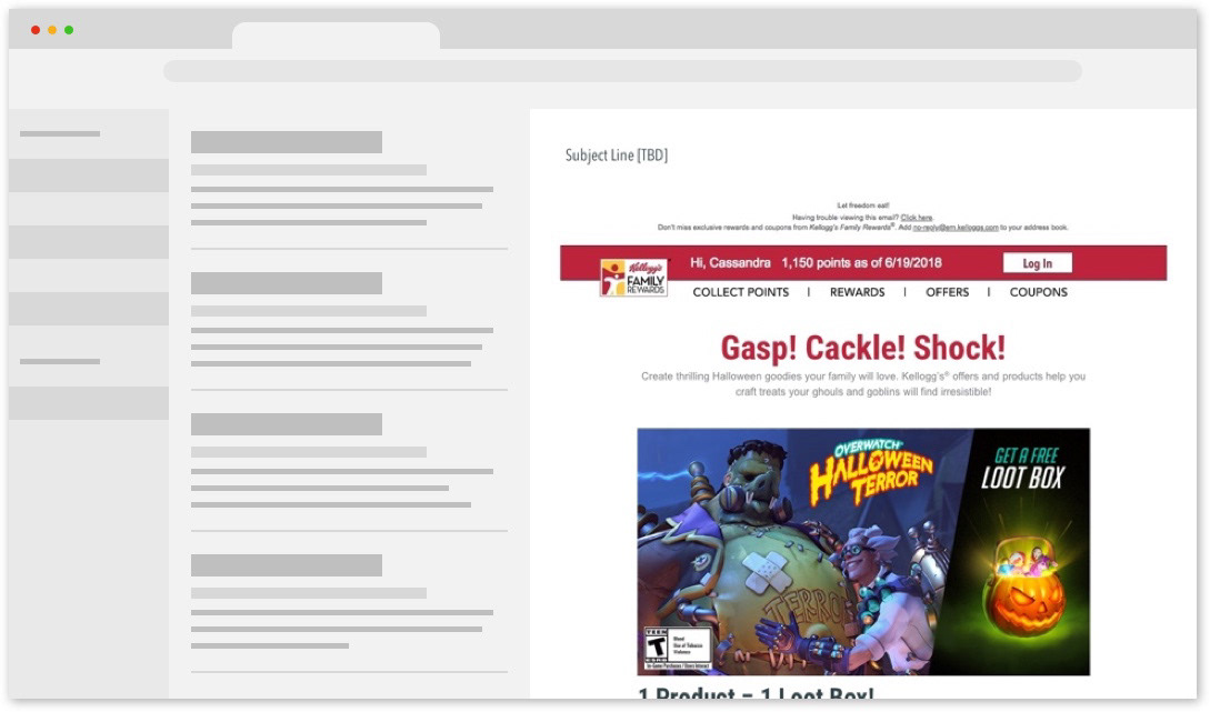
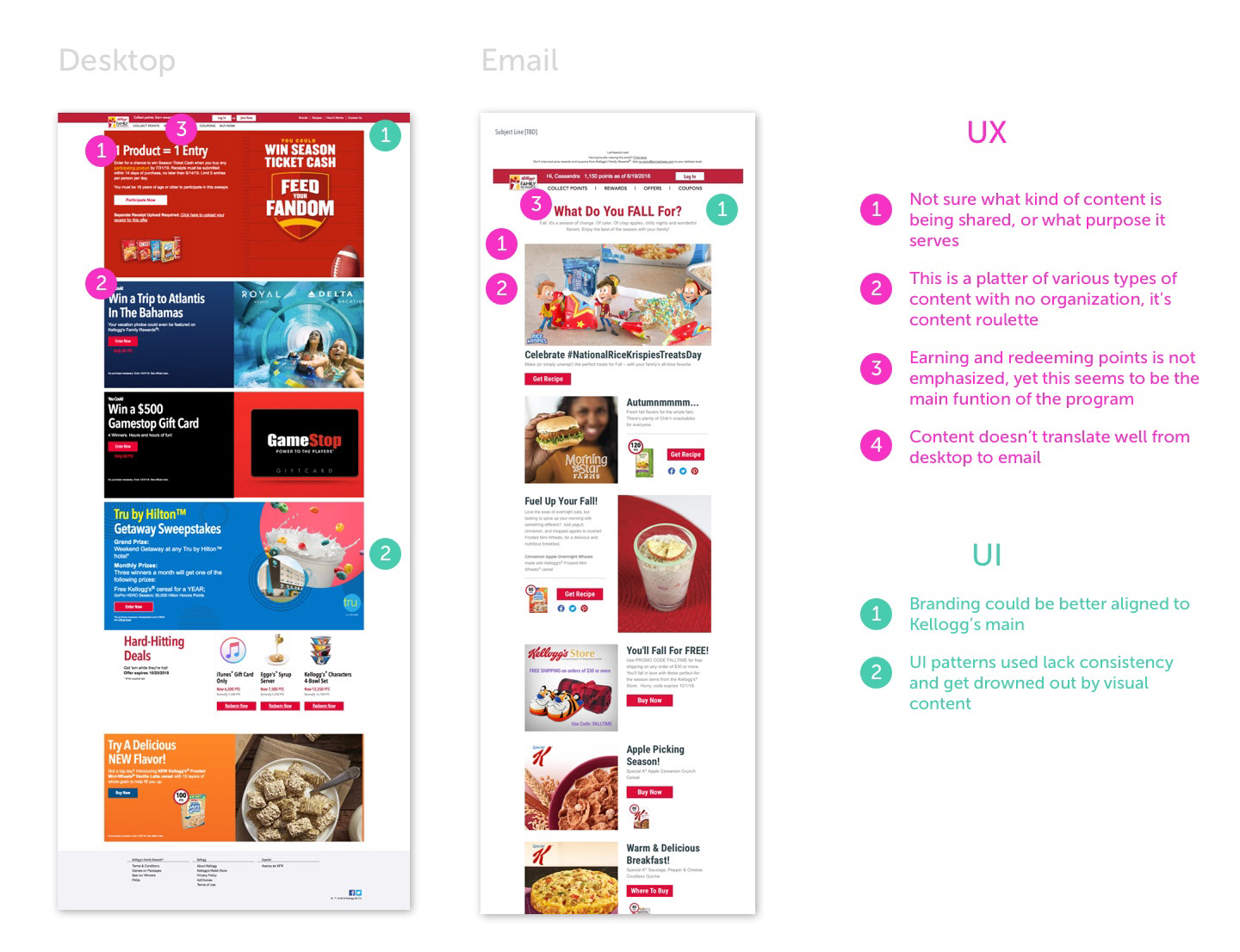
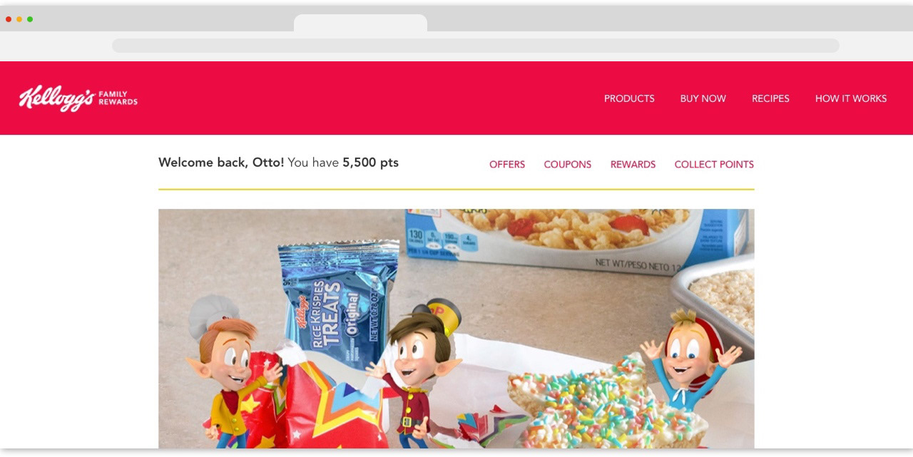
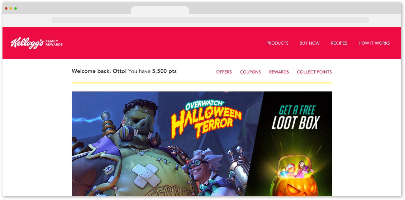
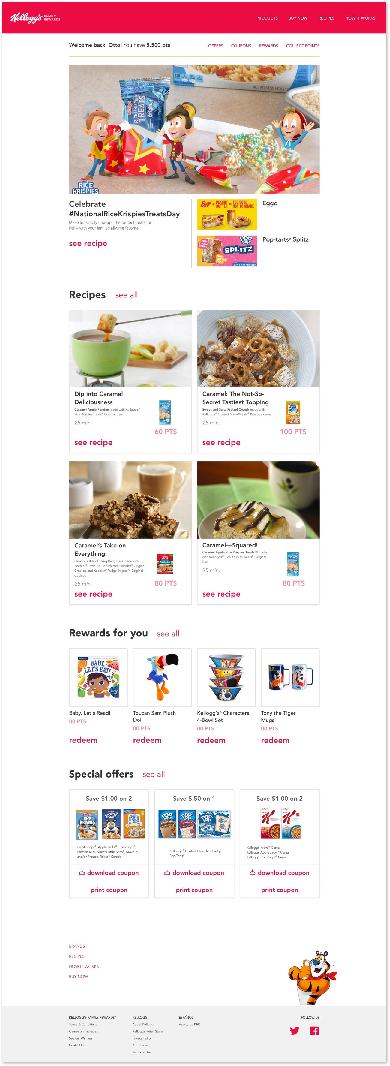
I updated the nav bar to feature a main nav and sub nav that was specific to user-centered functions (offers, coupons, rewards, points).

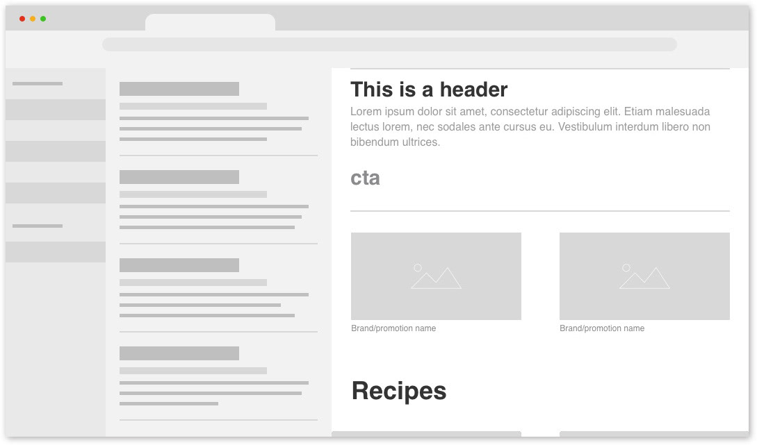
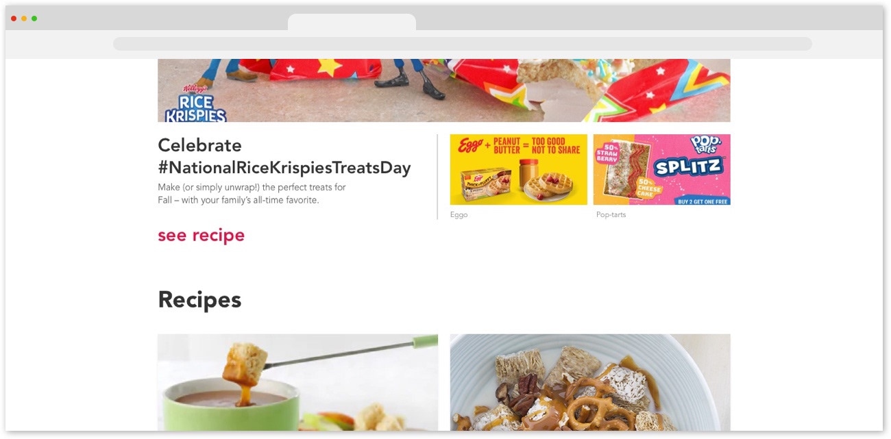
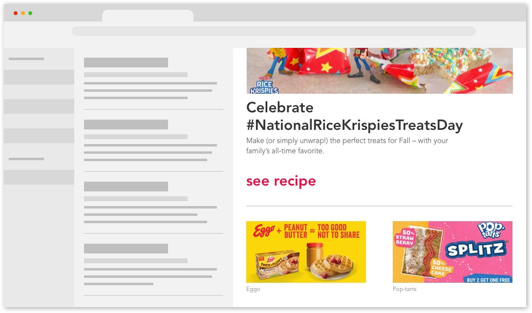
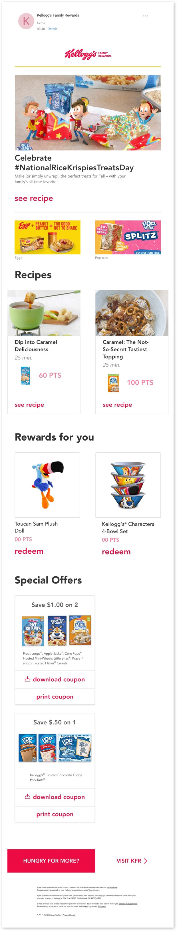
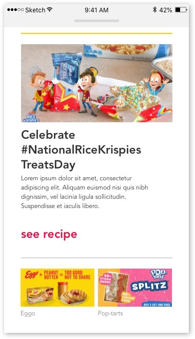
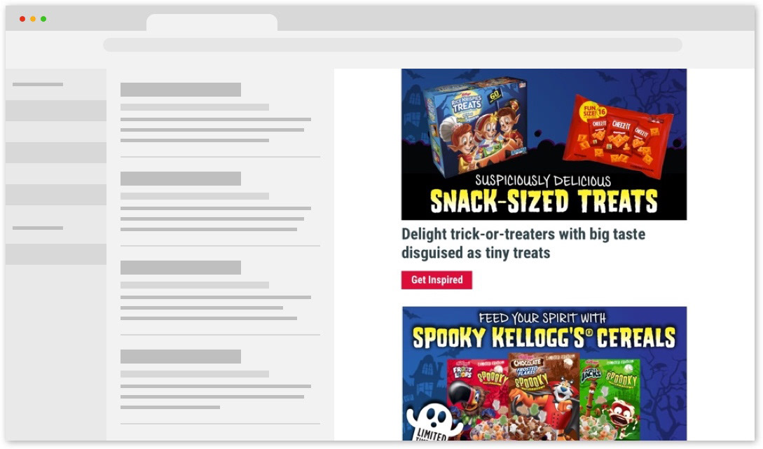
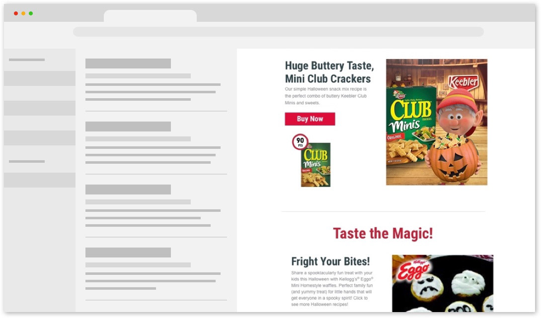
I created a promotions module where the intended functionality was to rotate through hero images and their accompanying copy and cta. 

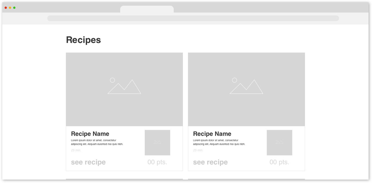
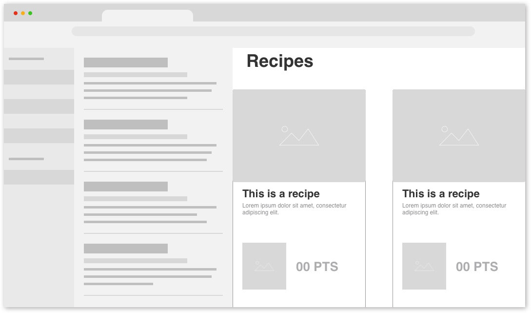
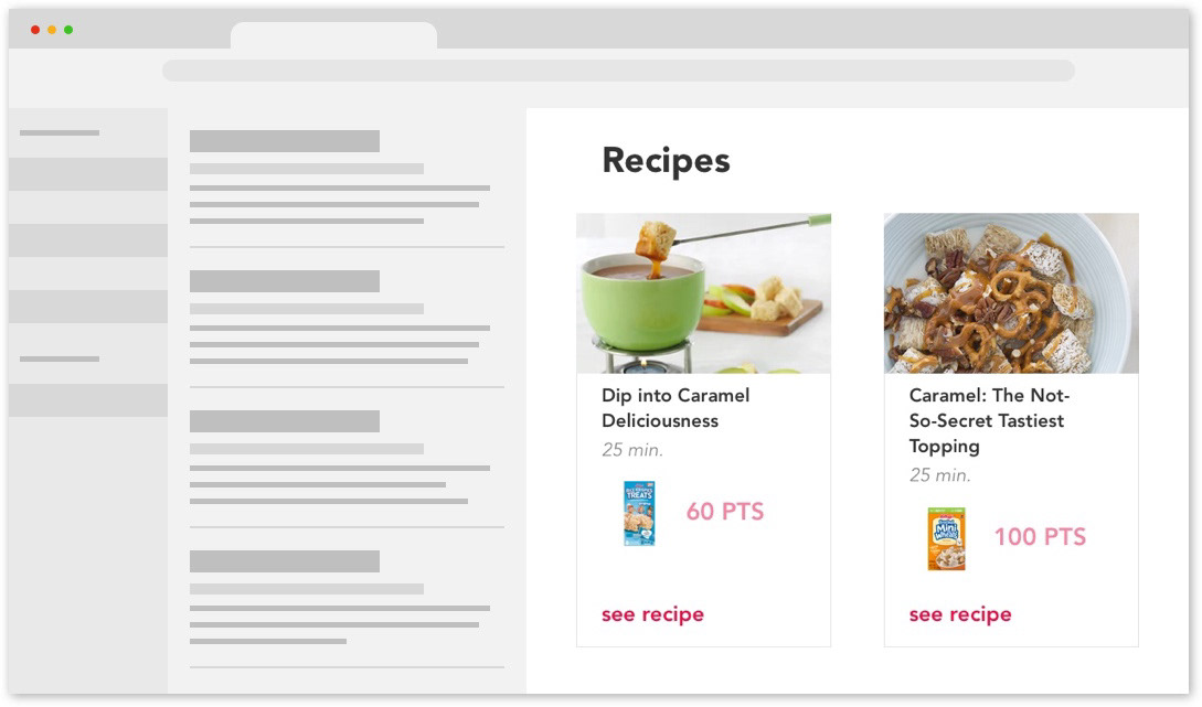
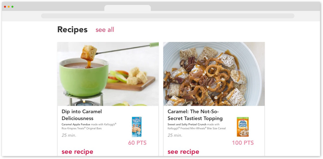
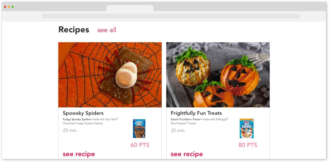
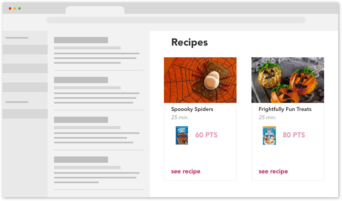
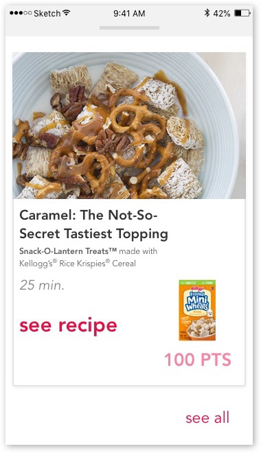
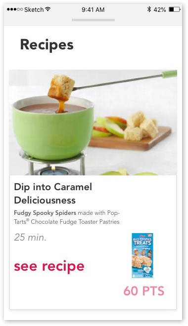
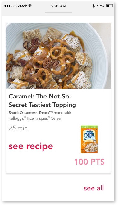
I put recipes on wider cards to play up the appetite appeal of the recipe images. I kept the product shot and point value tucked together and in its own space.

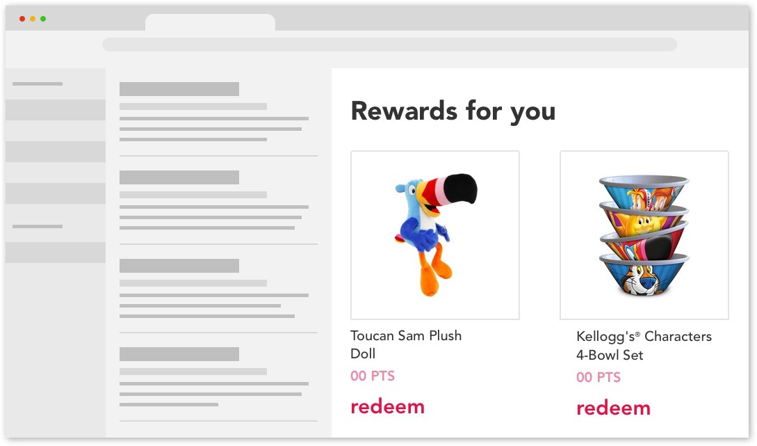
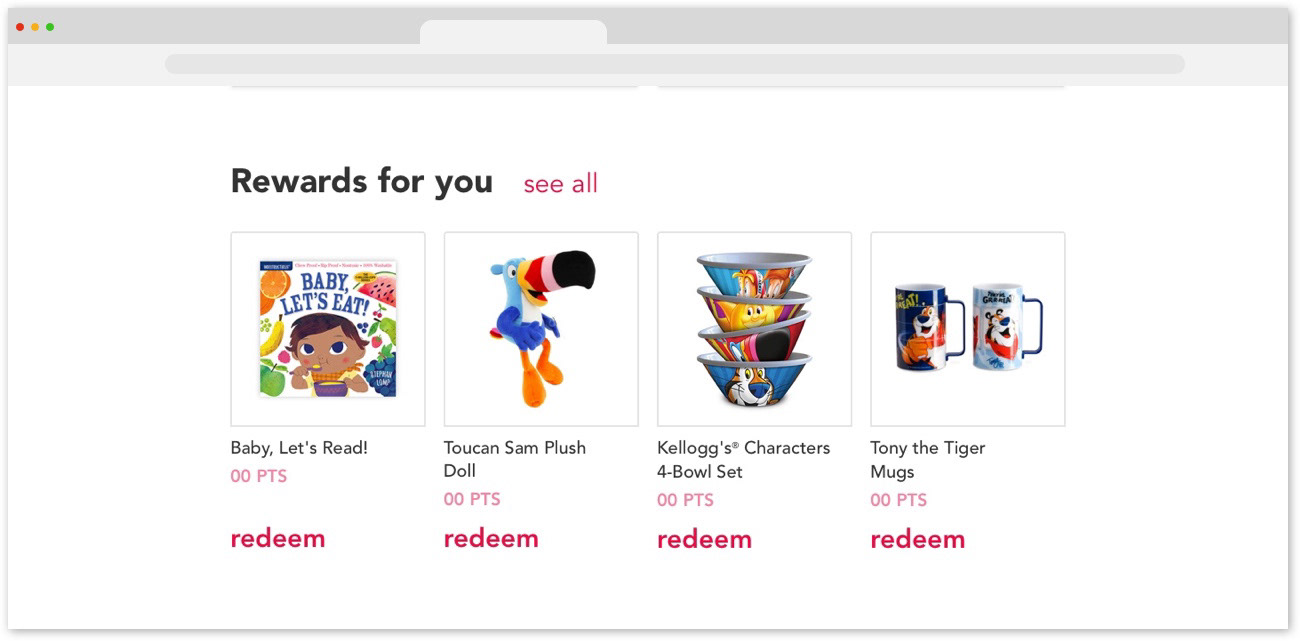
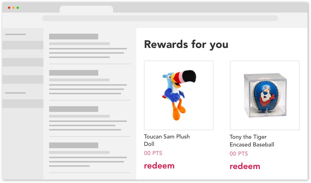
Rewards were simpler cards to create. Since rewards images are square and a user could be offered a few different rewards at once, I made these cards small and simple. 

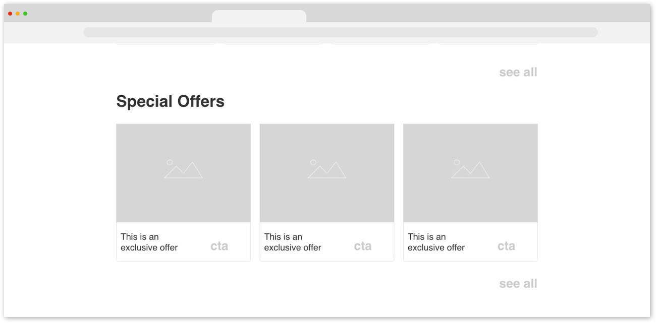
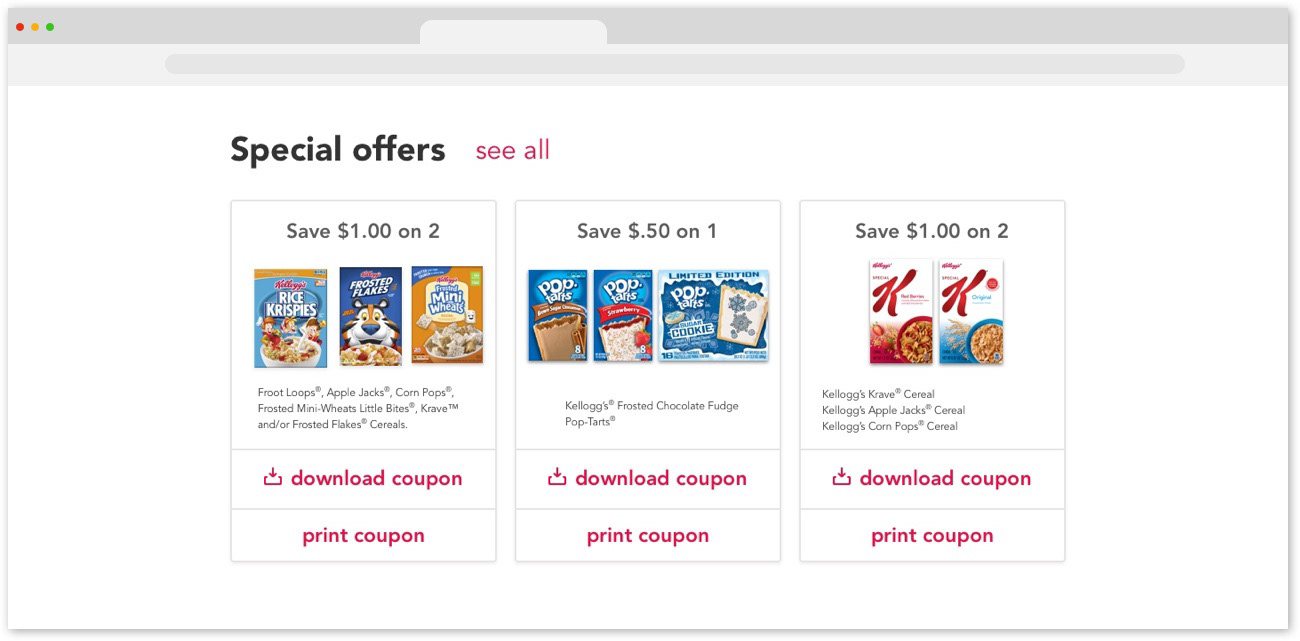
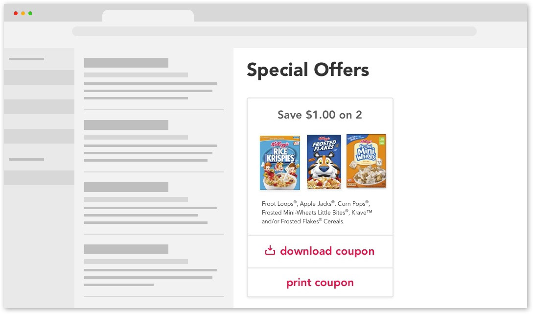
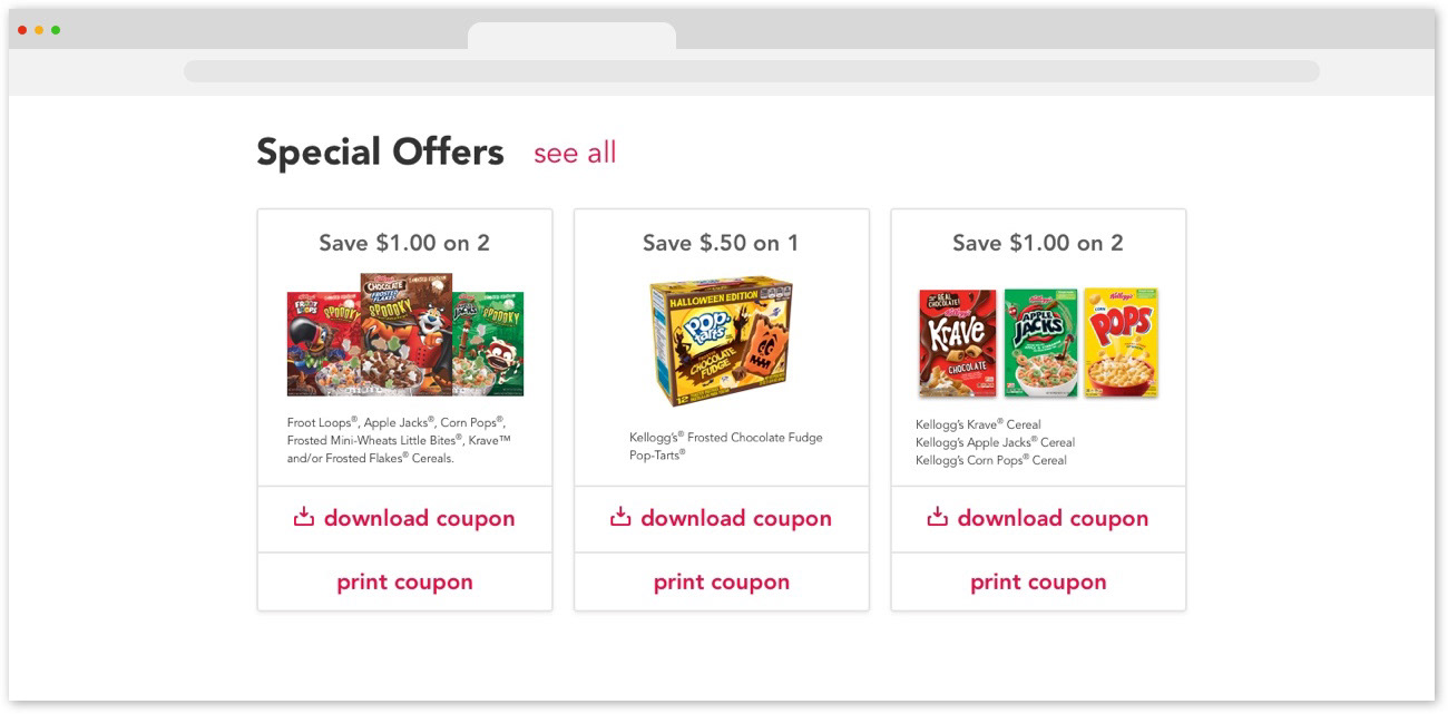
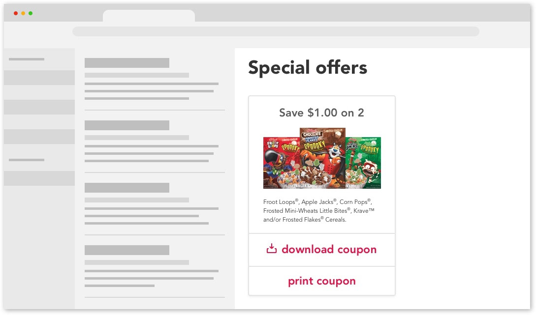
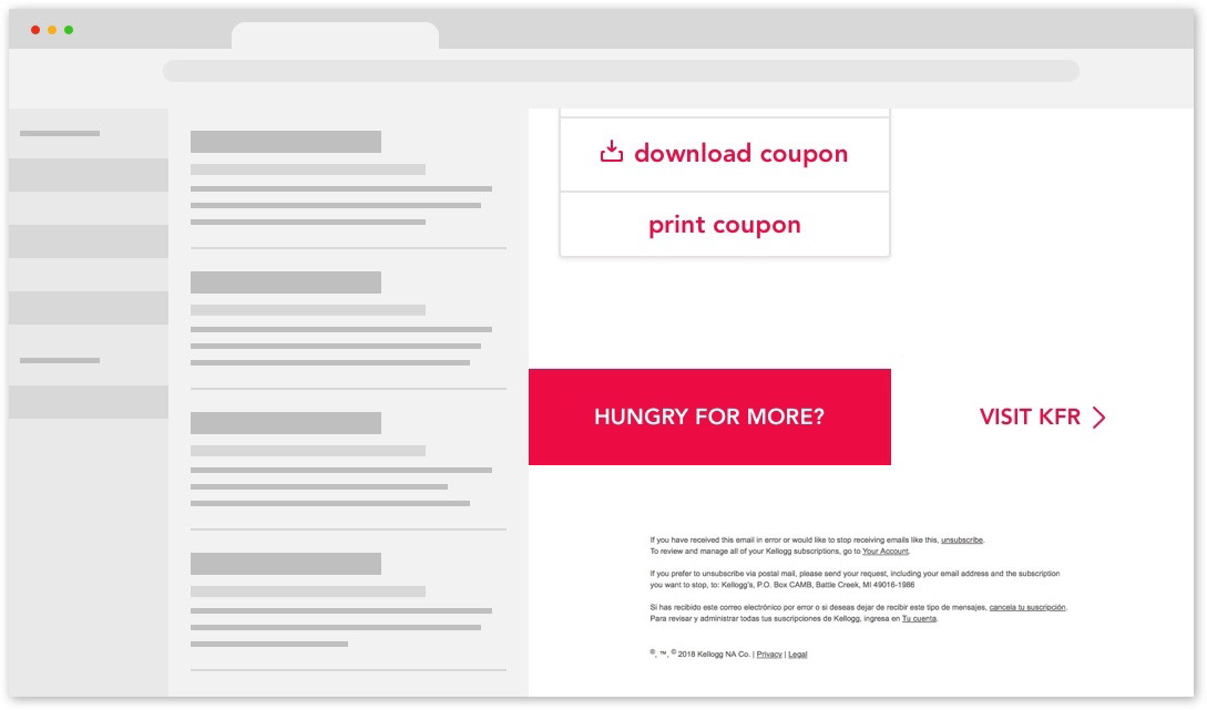
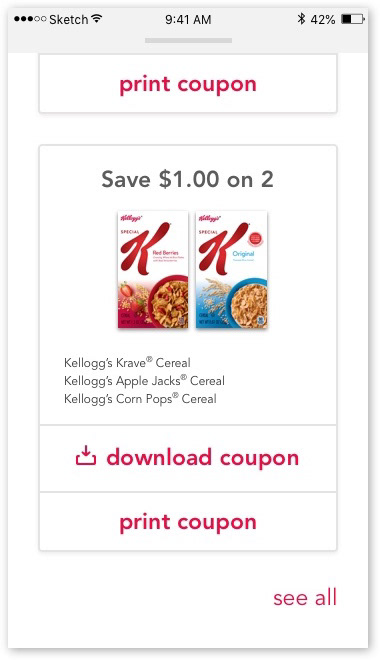
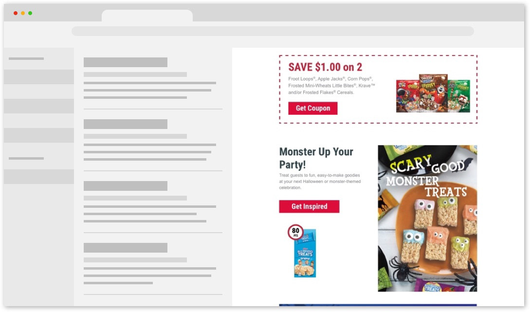
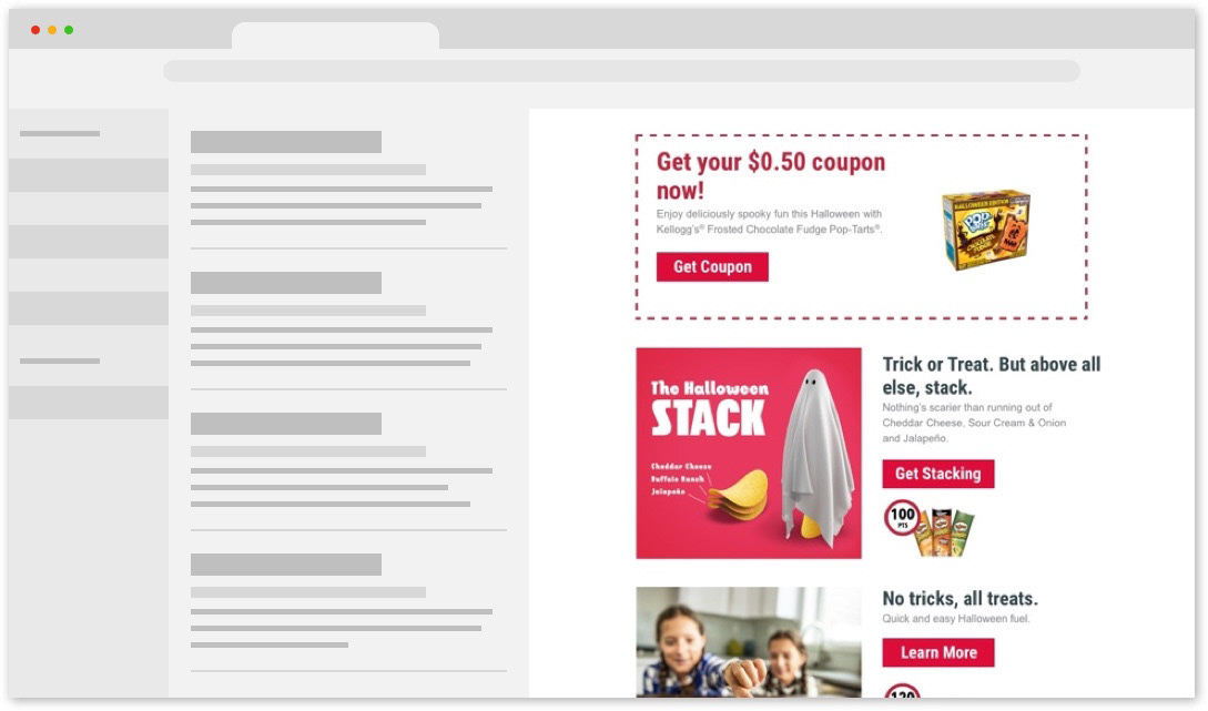
Special offers/coupon cards are similar to rewards in their simplicity, but often feature multiple product shots. I made these cards a bit wider to accommodate for the space.

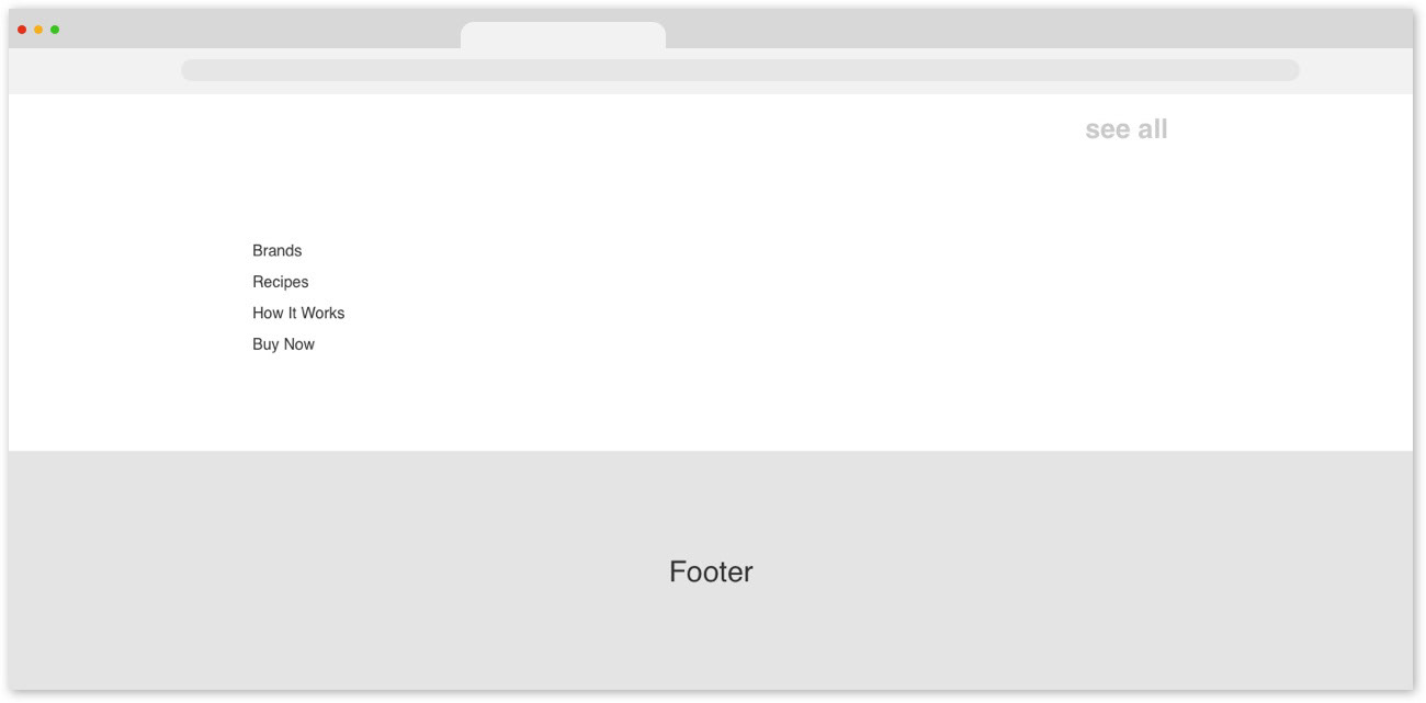
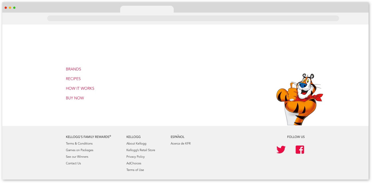
I added the main top nav to the bottom as well to ease overall navigation throughout the page.

Email (scroll-through screenshots)
I made as many website components as I could easily transferable to the email (i.e. card styles, visual hierarchical elements, etc.). This would help in our goal to ease the workflow between teams. In this case, specifically for the creative and development teams.  
After creating and re-analyzing the wireframes, I made notes on small things to keep in mind going into the UI design. The card design treatment was going to be an important aspect of this design to keep track of.
Hi-fidelity Mockups

I then built my first round of high fidelity mockups for both the site and accompanying emails. I created mockups for 2 different themes to convey how the varying tones of email themes would be communicated through my designs. These 2 visual directions were communicated through moodboards. 
Below are the highlights of my main changes:
Website (scroll-through screenshots)
Email (scroll-through screenshots)
I then tested these designs and consolidated the feedback to know what else needed to be improved on. The hero image gallery for the website that serves as the promotions section was difficult to interpret. I also needed to bring some consistency to the recipe cards in the emails. I iterated further keeping these things in mind. 
Website (scroll-through screenshots)
Email (scroll-through screenshots)
Halloween Theme
Website (scroll-through screenshots)
Email (scroll-through screenshots)
Before and After

Below is a side-by-side before and after of the KFR homepage. I brought a content hierarchy to the site and established a visual standard for homepage content so that it wasn't a mishmash of visual elements and content all thrown onto a page.
I also organized varying types of content into their own sections of the site, so users knew what they were looking at as they navigated through the page. We also reeled in their content strategy. Before, the emails were a wild and crazy crapshoot of whoever could get their brand featured for that week, which resulted in very long, cluttered emails, and misaligned content. Our new structure required them to think more meticulously about how to feature brands and content for both the site and emails.  
Website (full mockup)  
Email (full mockup)
Mobile

We were picking this project up from a previous agency and the original site and email were not designed for mobile. 
In my redesign, I made an effort to make as many elements as possible adaptable for both desktop and mobile. I did this by arranging card styles between a 12-column grid. This way, they could be scaled down using the correct image size aspect ratio, and, they could be organized evenly within the grid. This grid can be any number of columns that is a multiple of 12.

Mobile - Website 
Mobile - Email
Reception

The client loved the fact that a design system was being established. They weren't really familiar with design systems, but it was essentially what they had been hoping for in terms of optimizing the teams workflow. It would make working between our agency team and their team flow a lot better than it had been prior to our work on the project. They also liked how much cleaner the new design looked versus what they originally had.
As for working between teams within the agency, implementing the initial stages of this new design made for better communication between our team and the art direction team. Image sizes were established, we knew how many different types of content we would need creative for, and the design had begun to curate the content to better express a visual tone. 
Going Forward

I would have liked to test out how more copy would work into our layout. There's room for additional copy in each section that could serve as entry copy into that section. This could also serve as a thematic complement to the visual content that lives on the site for that week. 
I also would want to dive into the points system deeper. It seems as though the various ways users can earn and redeem points is often overlooked. 

You may also like

Back to Top